2026
Web (Desktop & Mobile)
Portfolio

A modular case-study platform designed to communicate complex projects through structured narrative, contextual navigation, and scalable architecture.

Stack
  • Type: Portfolio · Case Study Platform
  • Role: Product Designer · UX/UI · Frontend Development
  • Scope: Information Architecture · Narrative Design · Contextual Navigation · Responsive System · Performance Optimization

01. Snapshot

Quick project overview, scope, role, and overall context
Intro

This portfolio was conceived not as a visual gallery, but as a structured product system designed to communicate process, thinking, and technical execution.

The objective was to transform complex projects into clear, digestible narratives while maintaining architectural consistency, scalability, and technical coherence.

The approach prioritized content architecture before visual styling, defining a repeatable structure for every case study.

My Role
Designing a scalable narrative architecture for case studies Developing a modular section-based system Implementing contextual sticky navigation Crafting responsive interaction patterns Building a custom WordPress theme from scratch Developing custom JavaScript logic for advanced interactions
Client
Aitor Arina
Users
Recruiters · Product Teams · Potential Clients
Business Goal
Explaining all my tech skills
Key Challenge
Translating complex projects into structured, clear storytelling
Devices
Desktop-first · Mobile optimized
CMS
WordPress

02. Screenshots

Key product screens that illustrate design and usability decisions
*You can click on an inmage or stay on ti so the carousel will stop moving

03. Challenge / Solutions

Key issues identified and the design decisions made to address them
Challenge
  • Presenting long-form case studies without overwhelming the user

  • Avoiding disorientation in deep-scroll layouts

  • Maintaining consistency across multiple projects

  • Showing technical depth without clutter

  • Designing a structure scalable for future work

  • Minimizing dependency on third-party plugins

Solution
  • Fixed structural framework across all case studies

  • Contextual sticky navigation with active section tracking

  • Clear separation between UX narrative and technical implementation

  • Modular template architecture

  • Scroll-based progressive disclosure

  • Fully custom, performance-focused development

04. Context

Comprender el contexto del proyecto, sus limitaciones y los objetivos a alcanzar

The portfolio addresses a common challenge:


How to communicate both design thinking and technical capability in a single, coherent system.

Rather than designing isolated pages, the focus was on defining a universal structural framework before building visual layers.


Priority order:


Architecture → Hierarchy → Navigation → Interaction → Visual Design

05. Core Experience Design

How the product is structured, navigated, and experienced from the user’s perspective

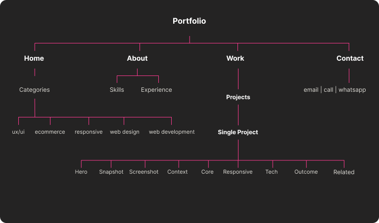
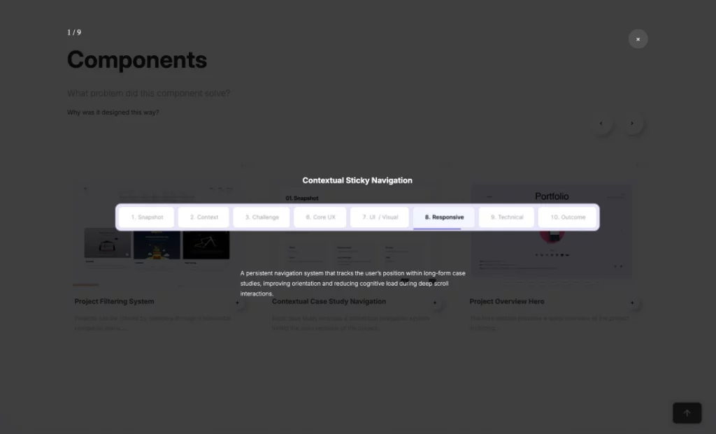
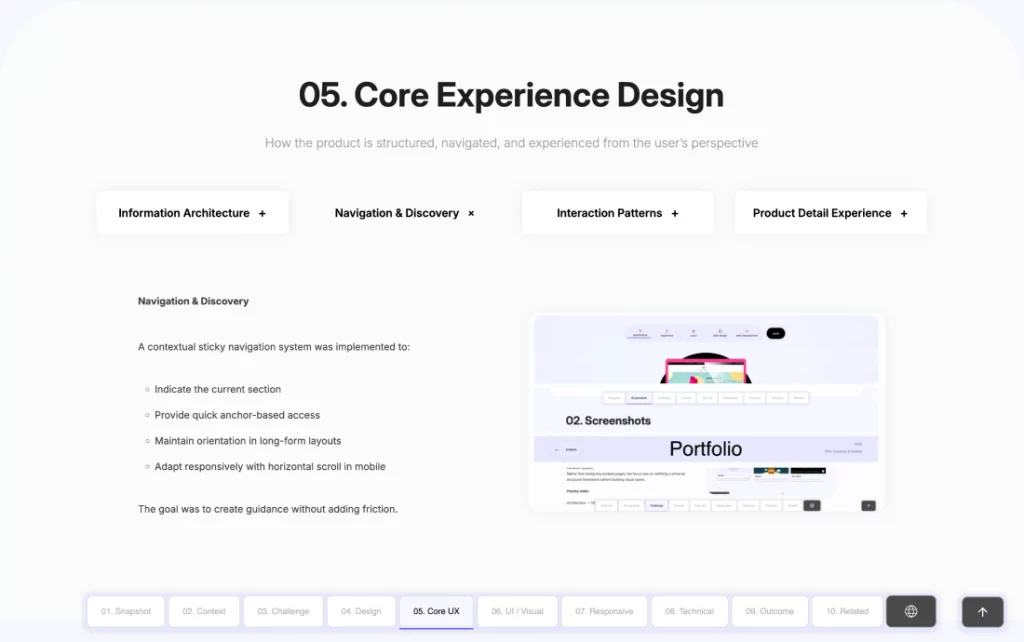
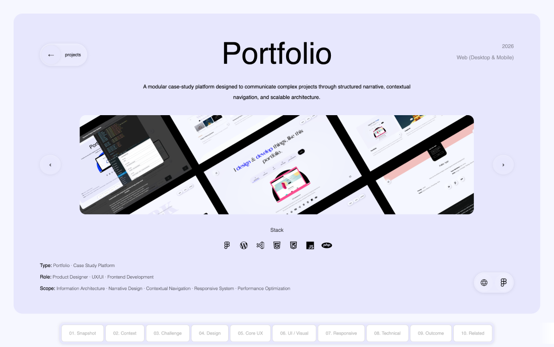
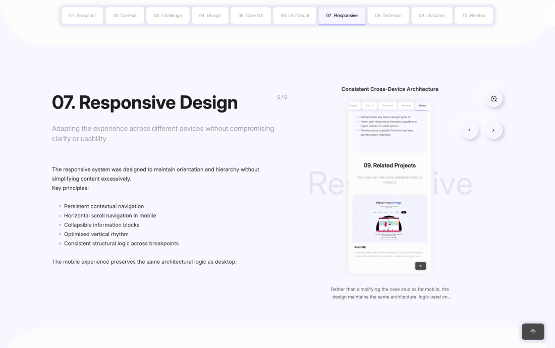
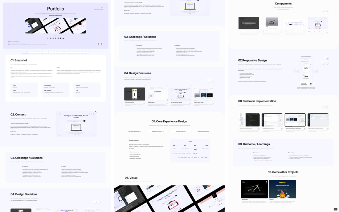
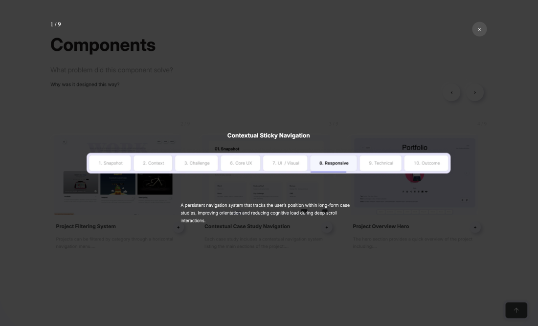
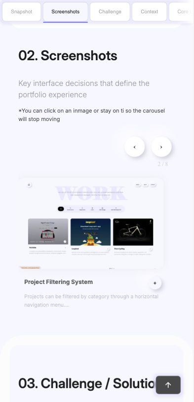
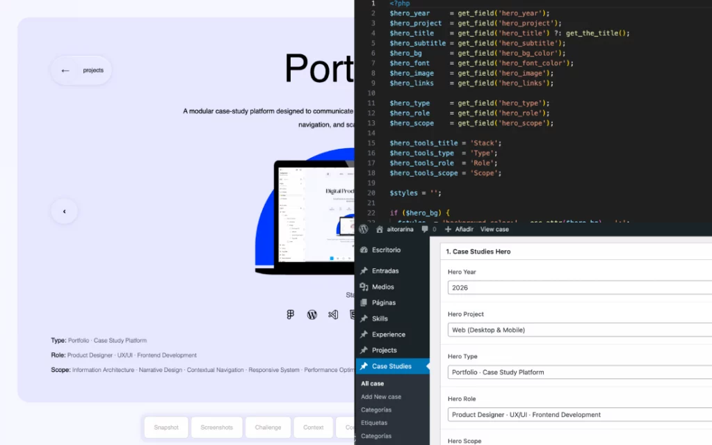
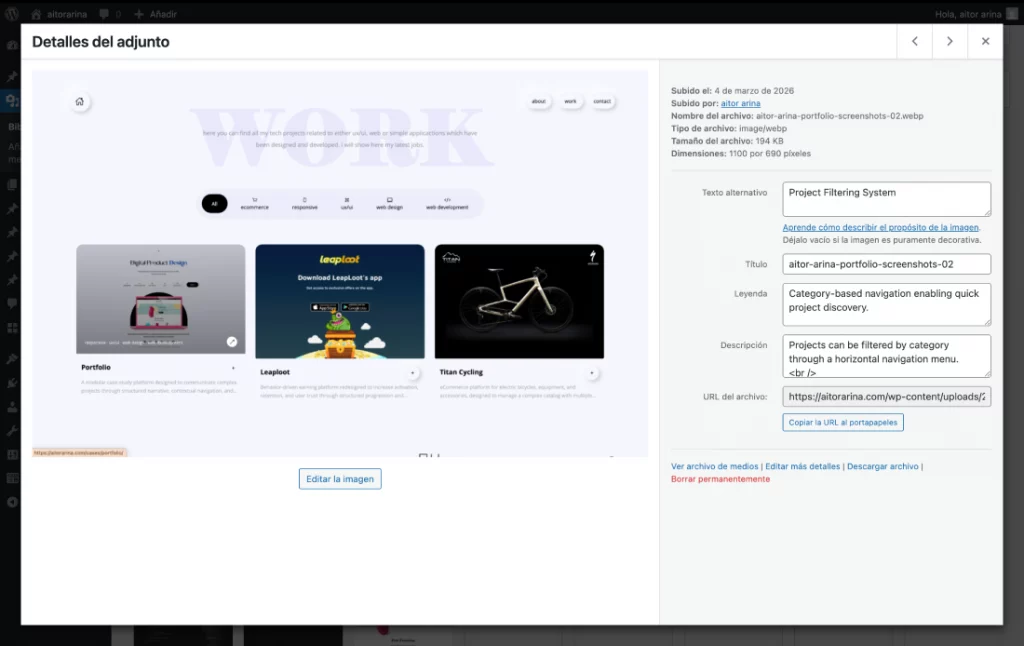
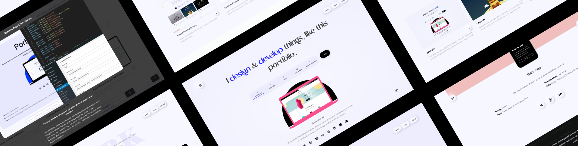
Information Arquitecture

Each project follows a consistent structural sequence:

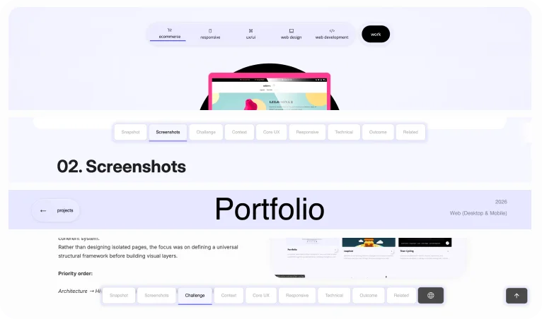
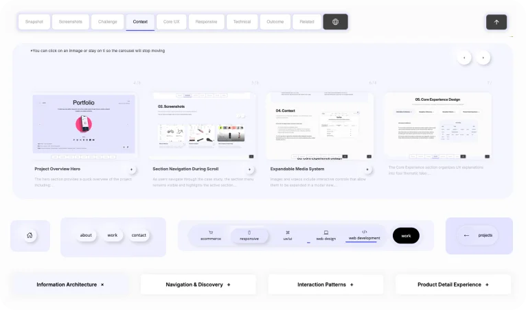
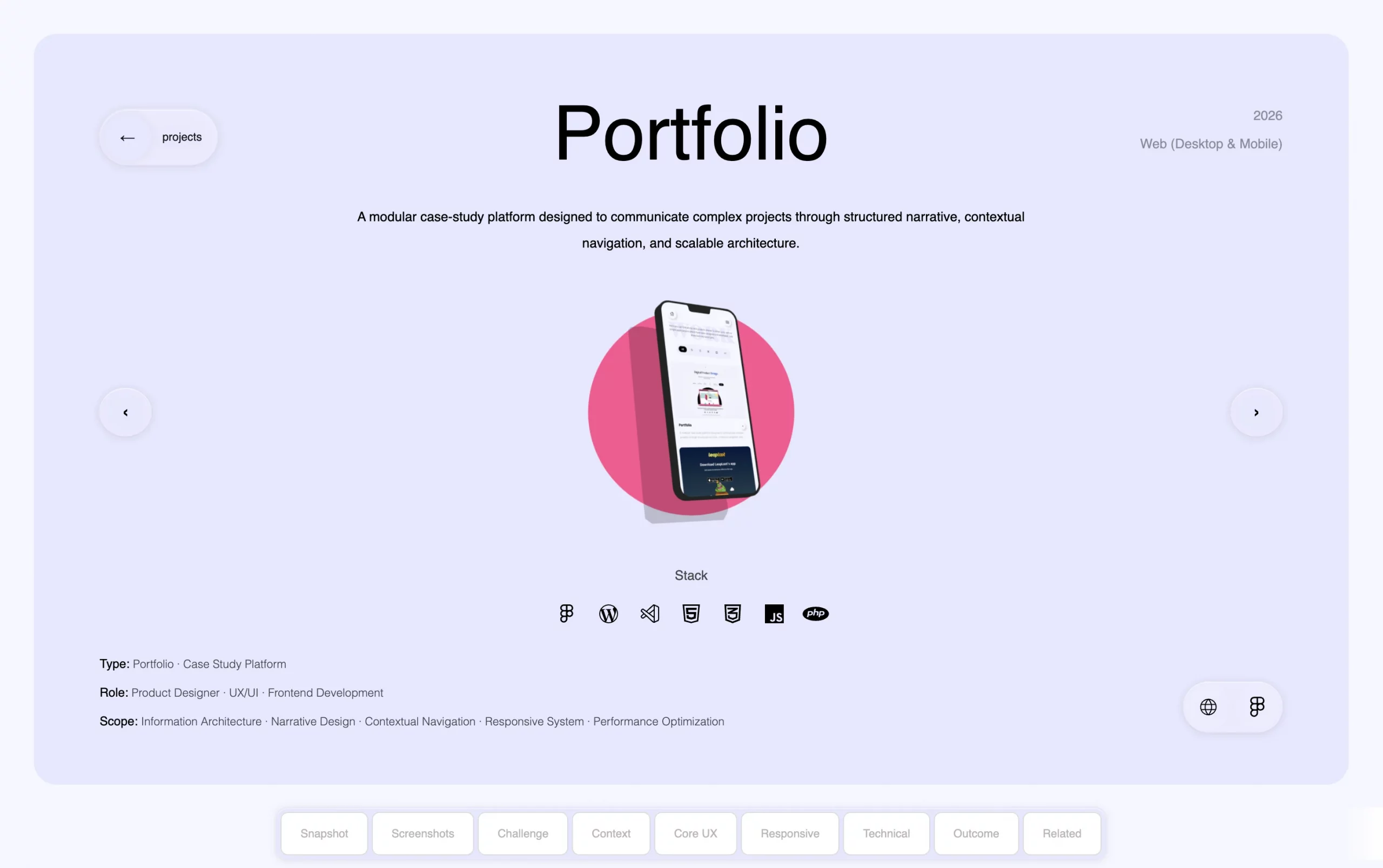
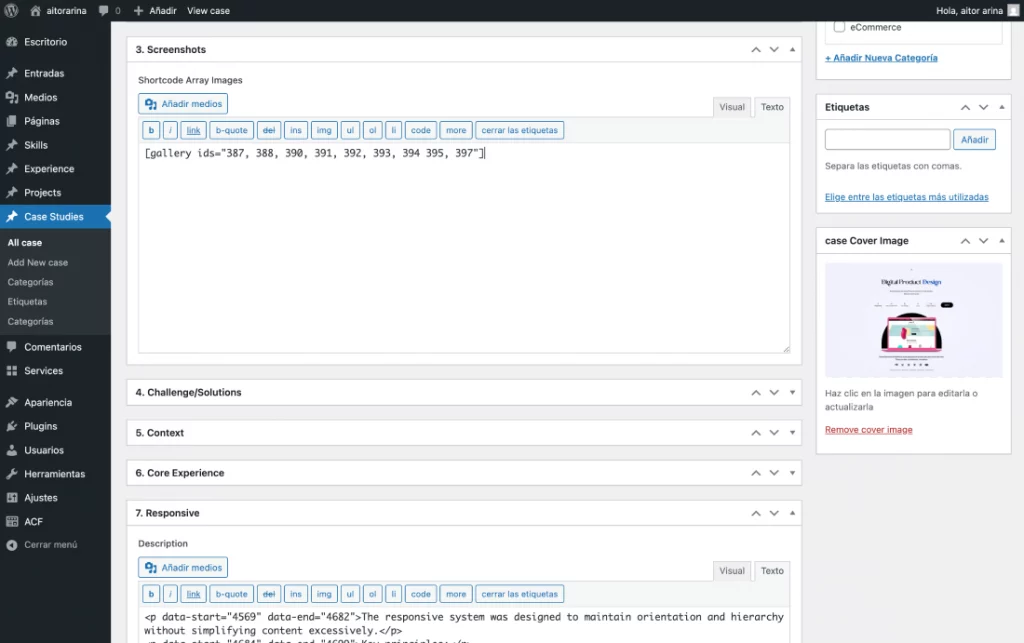
Snapshot → Screenshots → Challenge → Core UX → Responsive → Technical → Outcome

This ensures:

  • Reduced cognitive load

  • Clear narrative progression

  • Structural consistency

  • Scalability for future projects

Navigation & Discovery

A contextual sticky navigation system was implemented to:

  • Indicate the current section

  • Provide quick anchor-based access

  • Maintain orientation in long-form layouts

  • Adapt responsively with horizontal scroll in mobile

The goal was to create guidance without adding friction.

Interaction Patterns

  • Consistent tab systems

  • Accordion patterns in mobile

  • Scroll-based section activation

  • Controlled carousels without external libraries

  • Clear active states and predictable behavior

Interactions are subtle, intentional, and functional — never decorative.

Case Study Experience

Each case study is treated as a self-contained product narrative rather than a visual showcase.

The experience prioritizes:

  • Logical progression

  • Clear hierarchy

  • Separation of UX decisions and technical execution

  • Readability across devices

06. Responsive Design

Adapting the experience across different devices without compromising clarity or usability

The responsive system was designed to maintain orientation and hierarchy without simplifying content excessively.

Key principles:

  • Persistent contextual navigation

  • Horizontal scroll navigation in mobile

  • Collapsible information blocks

  • Optimized vertical rhythm

  • Consistent structural logic across breakpoints

The mobile experience preserves the same architectural logic as desktop.

07. Technical Implementation

CHow design decisions translated into a scalable and maintainable solution
  • Custom Theme Architecture
  • Modular Template System
  • Navigation Logic (JavaScript)
  • Asset Strategy
  • Hook-Based Architecture
  • Reusable Component System

08. Outcome / Learnings

Key issues identified and the design decisions implemented to resolve them
Outcome
  • Scalable case-study framework.
  • Clear communication of complex processes.
  • Balanced design and technical narrative.
  • High performance with minimal plugin footprint.
Learnings
  • Narrative architecture is as critical as visual design.
  • Simplicity in interaction increases perceived professionalism.
  • A portfolio is itself a product.