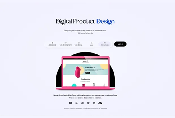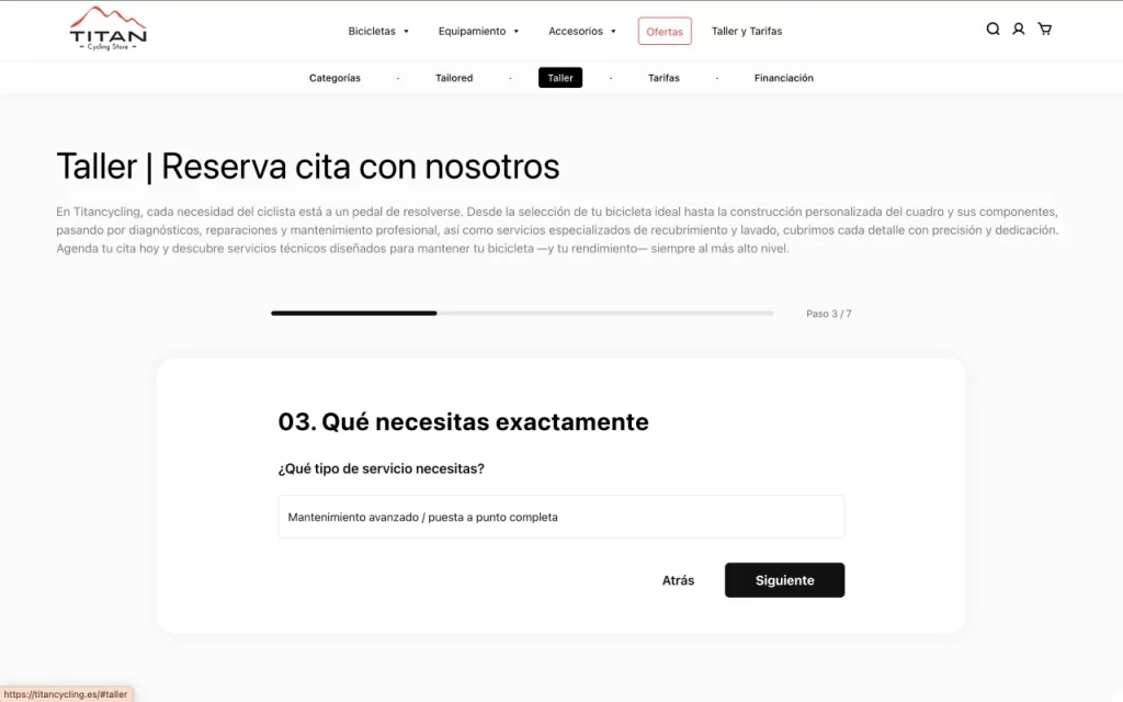
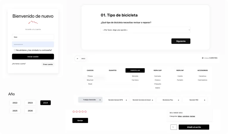
Guided Booking Flow
Home | Workshop Form
tep-by-step form reducing friction and improving conversion compared to traditional multi-field forms.
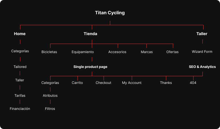
An eCommerce platform designed to structure and navigate a highly fragmented product ecosystem, combining bicycles, equipment, and services within a unified and scalable architecture.
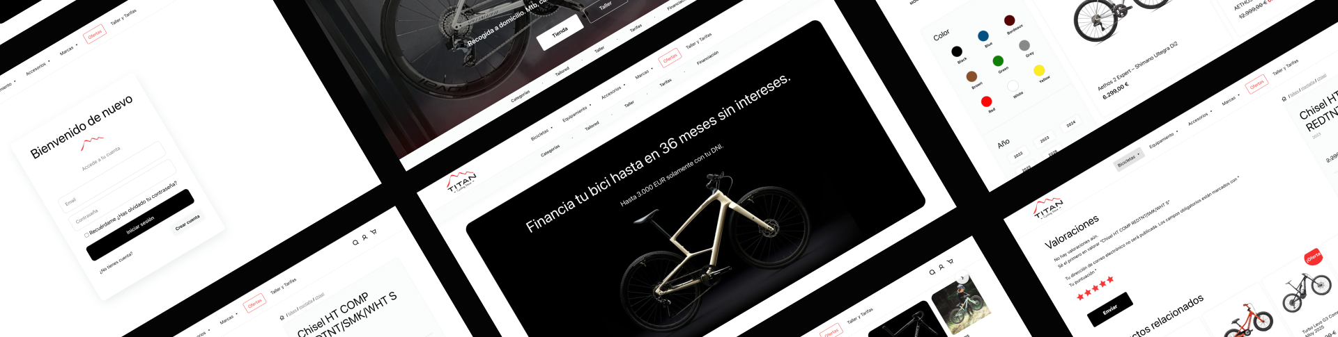
The project involved transforming a fragmented and unstructured product catalog into a coherent and navigable system.
This required defining a scalable information architecture, designing clear exploration and purchase flows, and supporting the technical implementation to ensure consistency between UX, UI, and development.
Defined the product taxonomy and hierarchical structure from an unstructured dataset.
Designed navigation and filtering systems adapted to different levels of complexity.
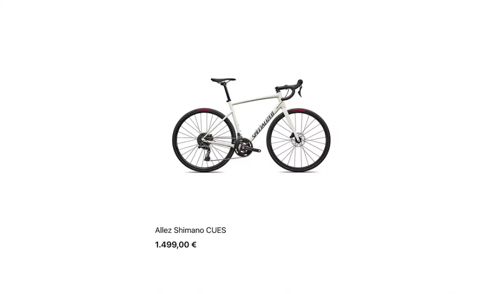
Rebuilt the product detail experience to balance technical depth and conversion.
Collaborated on custom WooCommerce implementation using ACF and template overrides.
Coordination between design and development through custom WooCommerce templates.
Before the design phase, the project started from a structurally unorganized product system:
Rather than starting with interface design, the first step was to define a coherent product structure.
The catalog was reorganized into a unified taxonomy system, enabling consistent navigation, scalable filtering, and structured product presentation across the entire platform.
 Challenge Solution
Guided Booking Flow
tep-by-step form reducing friction and improving conversion compared to traditional multi-field forms.
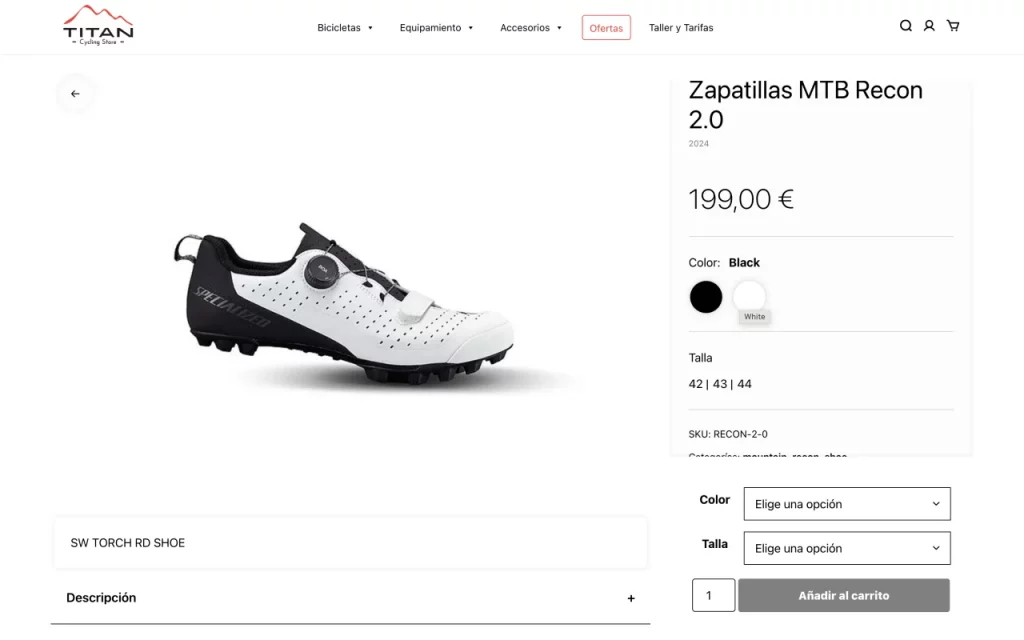
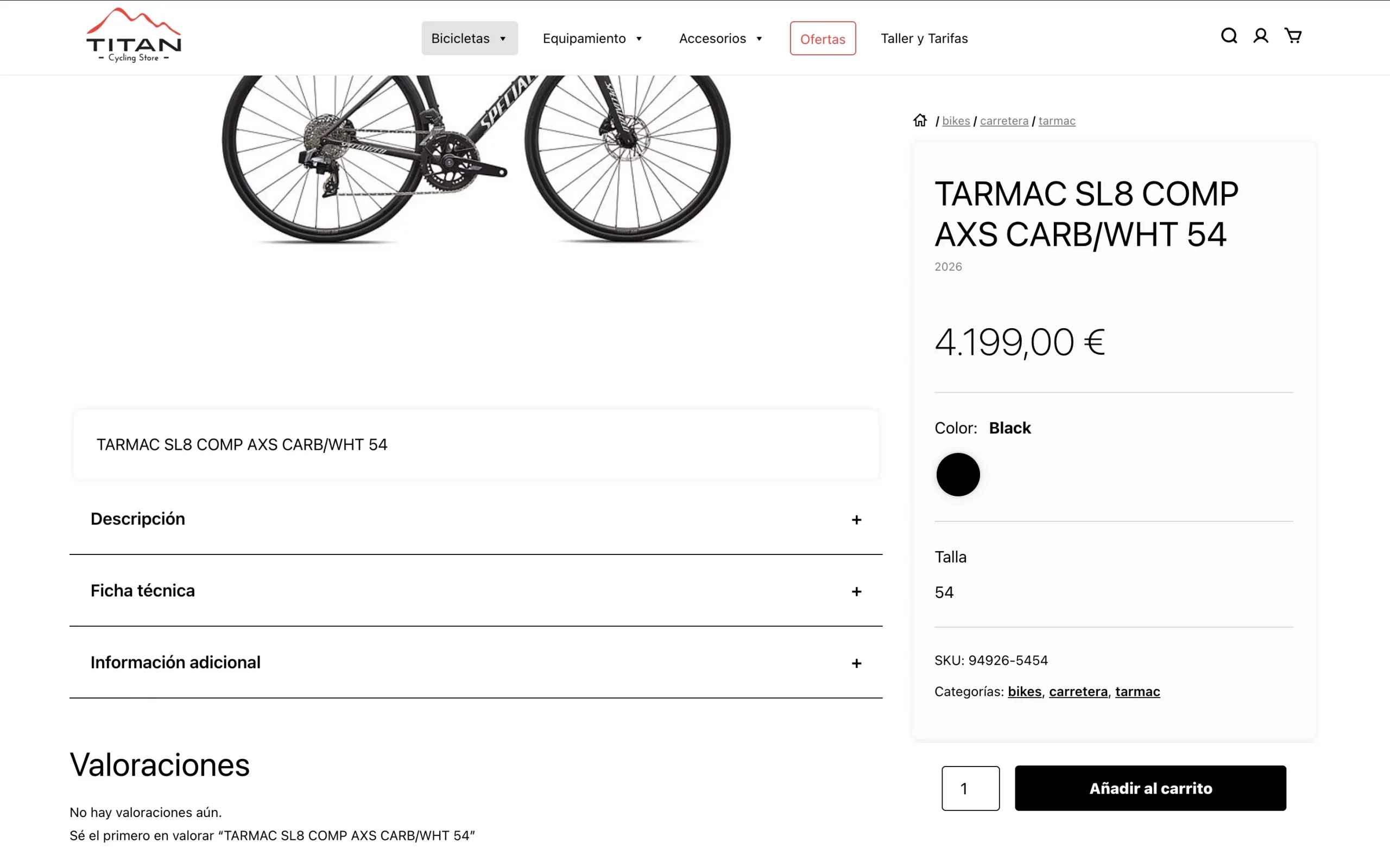
Sticky CTA & Split Layout
Separates technical content and purchase actions while keeping the “Add to Cart” always visible during exploration.
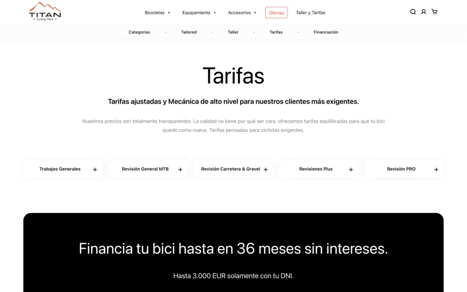
Responsive Tabs & Accordion
Combines tabs and accordions to structure dense information while maintaining clarity across devices.
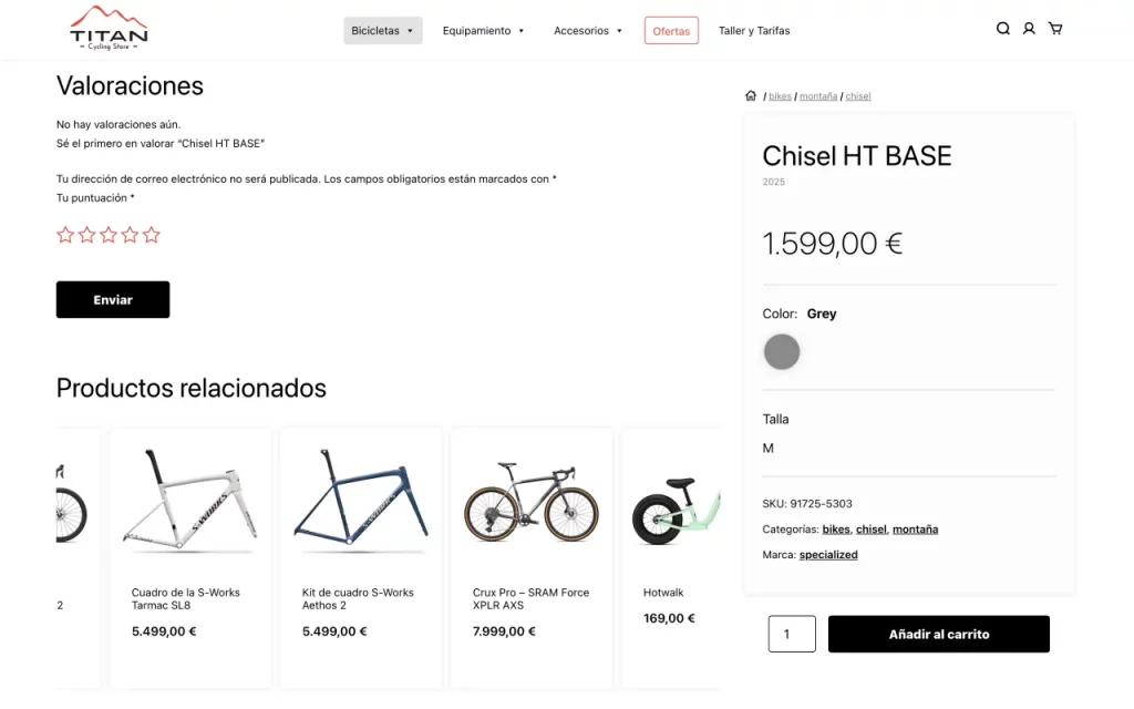
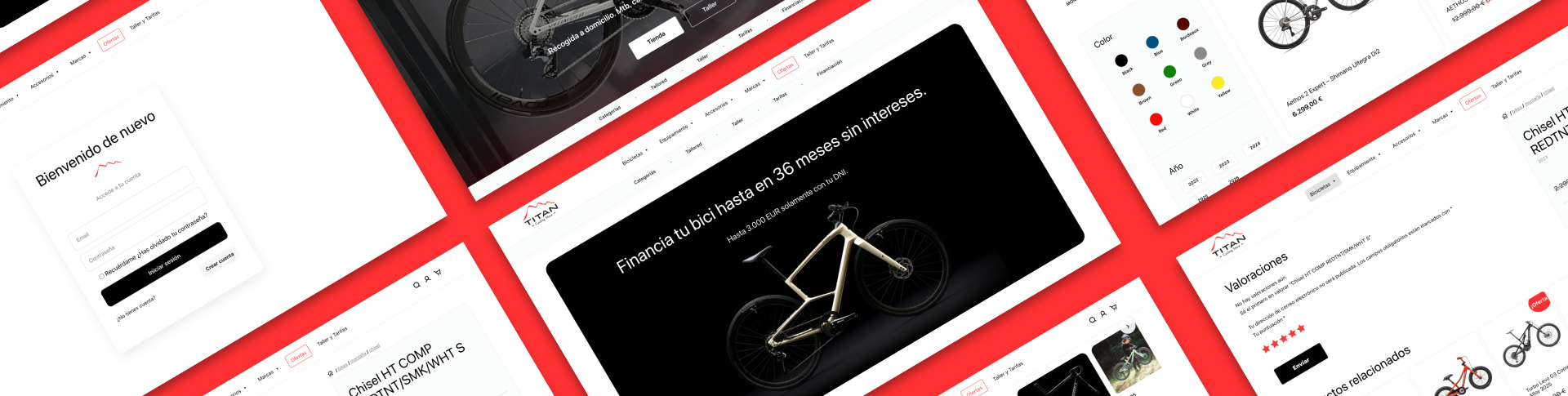
Cross-Selling Carousel
Infinite carousel promoting related products without disrupting the main product experience.
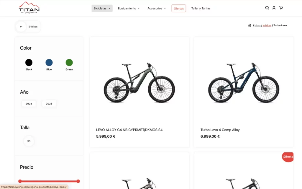
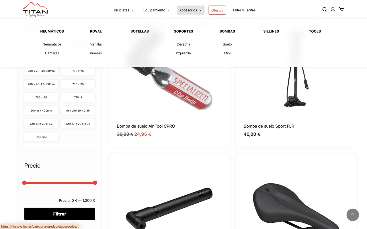
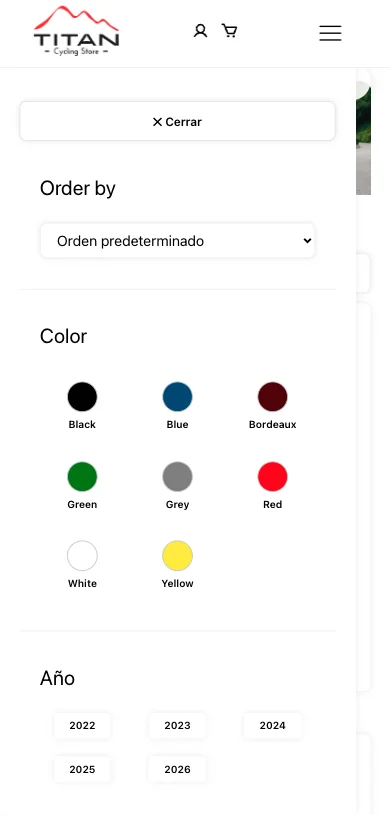
Adaptive Filtering System
Filters dynamically adapt to available options, reducing visual noise and improving usability.

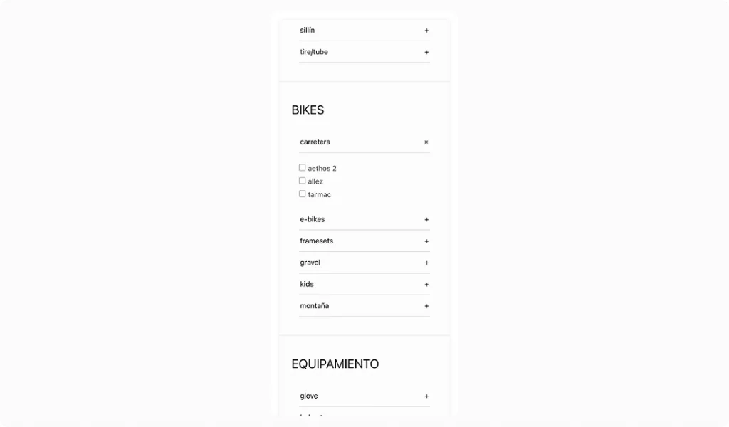
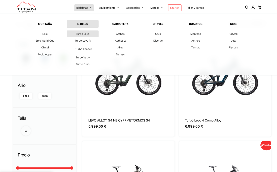
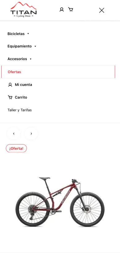
Hierarchical Menu Navigation
Menu structure reflects the full catalog hierarchy and highlights the user’s current position.
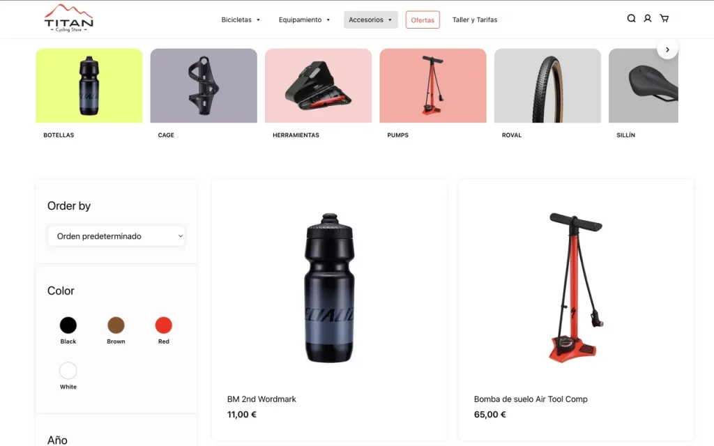
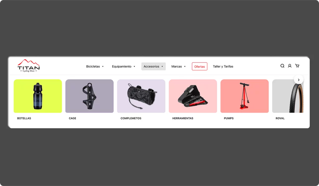
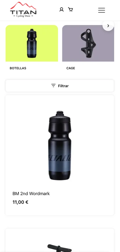
Visual Category Exploration
Prioritizes subcategories visually to simplify navigation within complex product structures.
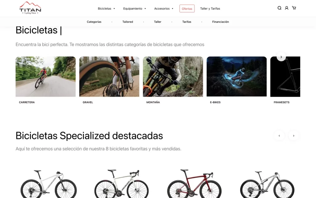
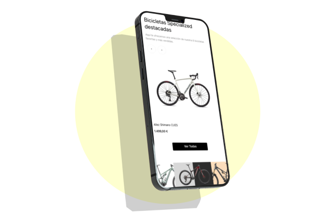
Product Discovery Carousel
Balances automatic progression and manual control to support product discovery.
Contextual Navigation System
Combines breadcrumbs and contextual back navigation to improve orientation across deep hierarchies.
The experience was designed to help users navigate a deep and technical catalog without losing orientation.
Navigation, filtering, and product detail pages work together as a system, progressively reducing complexity at each step.
Users can explore broadly, refine through filters, and access detailed product information without cognitive overload.
The navigation was designed to ensure users always understand where they are and what actions they can take at any given moment.
Visibility of key sections was prioritized, along with consistency across states, avoiding unexpected behavioral changes between screens.
Discovery patterns enable users to explore new features progressively, without requiring explicit instructions, supporting an intuitive experience.

Consistent interaction patterns were defined to ensure predictability and smoothness throughout the product experience.
Components such as buttons, cards, dropdowns, and interactive states behave consistently, reinforcing learning through repetition.
The system supports a “learn by doing” approach, enabling users to understand how it works through direct interaction rather than explicit instructions.
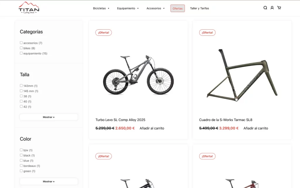
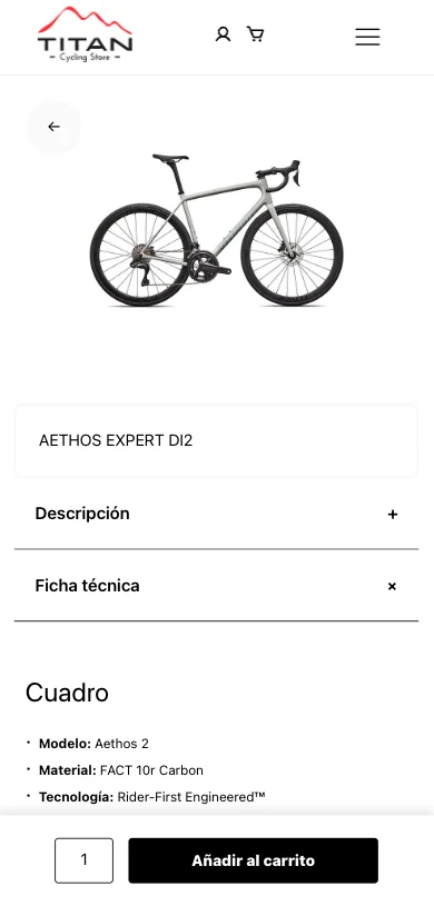
The detail experience was designed to present complex information progressively, avoiding cognitive overload.
Content is structured by levels of relevance: first, the essentials for the purchase decision (price, key attributes, CTA), followed by expanded information (technical specifications, descriptions, reviews).
The layout, featuring independent scroll areas and a sticky CTA, keeps the focus on conversion without sacrificing informational depth—enhancing trust and reducing friction in the decision-making process.
Compact product card combining key information and primary action
Reusable card component designed to display key product information in a compact and scannable format, balancing image, price, attributes, and primary action.
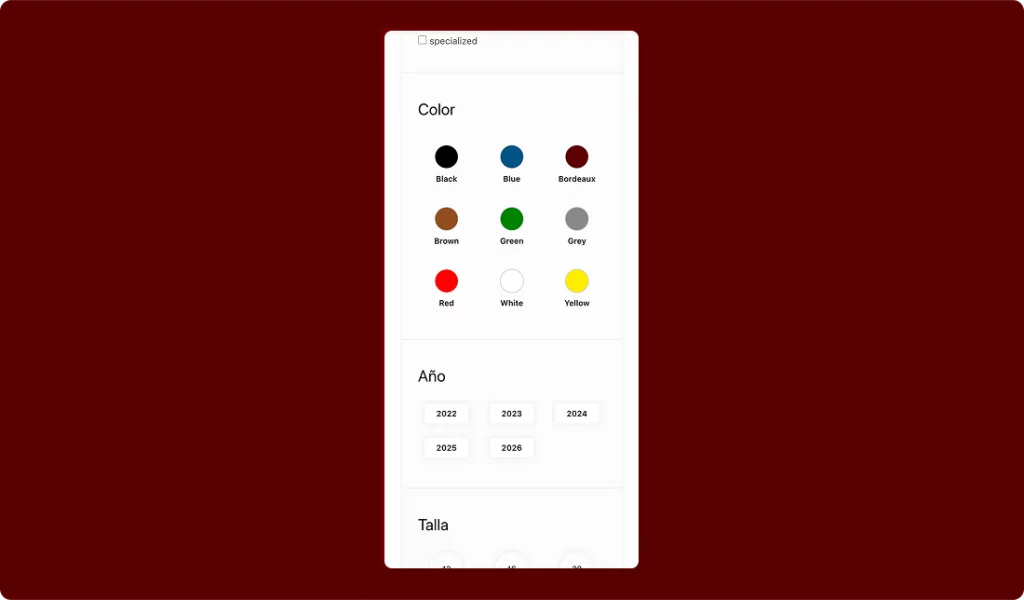
Flexible filtering system adapting to product attributes and categories
Dynamic filtering system that adapts to available attributes and category depth, allowing users to refine results efficiently without overwhelming the interface.
Visual blocks simplifying navigation across product categories
Visual category components designed to group products into recognizable segments, enabling faster navigation and intuitive exploration.
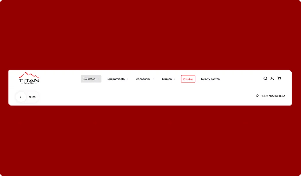
Navigation system providing clear orientation within complex hierarchies
Navigation system combining menu structure and breadcrumbs to reflect the full catalog hierarchy and maintain user orientation across navigation levels.
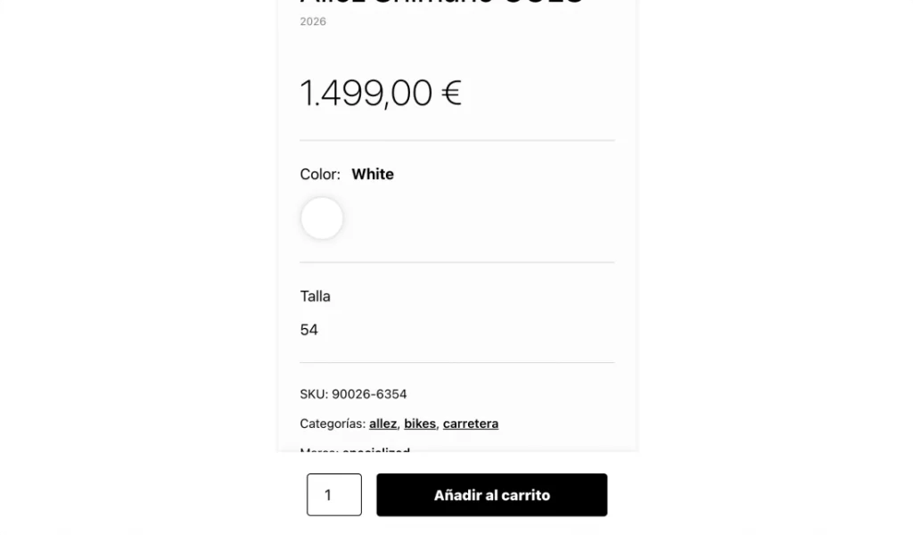
Sticky CTA maintaining purchase visibility during exploration
Persistent call-to-action component ensuring continuous visibility of the purchase action while users explore detailed product content.
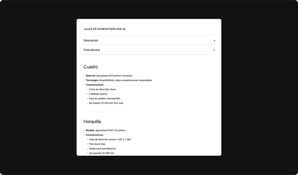
Structured product information displayed through expandable modules
Modular content blocks organizing technical specifications, descriptions, and additional information using progressive disclosure patterns.
Carousel enabling product discovery within the browsing flow
Horizontal scrolling component used to surface featured or related products, supporting discovery without disrupting the main layout.
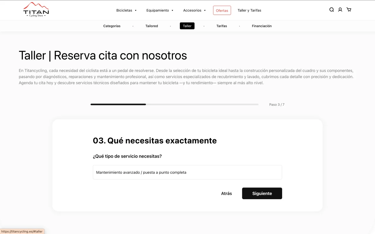
A guided multi-step flow designed to collect user, bike, and service information progressively, reducing friction and improving completion rates compared to traditional forms.

The layout balances technical product information and purchase actions through a split structure, allowing users to explore specifications while maintaining constant access to the purchase CTA.
Content is structured using a combination of tabs and accordions, enabling users to navigate pricing details progressively without overwhelming the interface.

A continuous carousel presents related products within the browsing flow, encouraging additional purchases without interrupting the main user journey.

Filters dynamically adjust based on available options, allowing users to refine results efficiently while maintaining clarity across different catalog states.
The menu reflects the full product hierarchy and visually indicates the user’s current location, improving orientation within complex category structures.
Subcategories are visually prioritized to guide exploration, helping users navigate complex product structures before engaging with detailed listings.

A homepage carousel highlights key products, combining automatic movement and manual interaction to support both discovery and control.
Complex catalog logic was preserved on mobile without simplification, only adapting interaction patterns.

La homepage se construyó mediante componentes reutilizables cargados con get_template_part(), separando estructura, lógica y presentación.
Este enfoque permite modificar, escalar o reutilizar bloques sin afectar el resto del sistema, facilitando mantenimiento y evolución futura del proyecto.
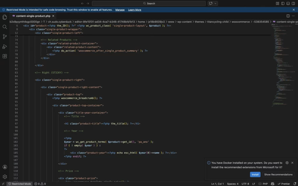
Single product page
Override de plantillas WooCommerce para redefinir layout, jerarquía informativa y comportamiento del CTA, manteniendo compatibilidad con actualizaciones futuras.
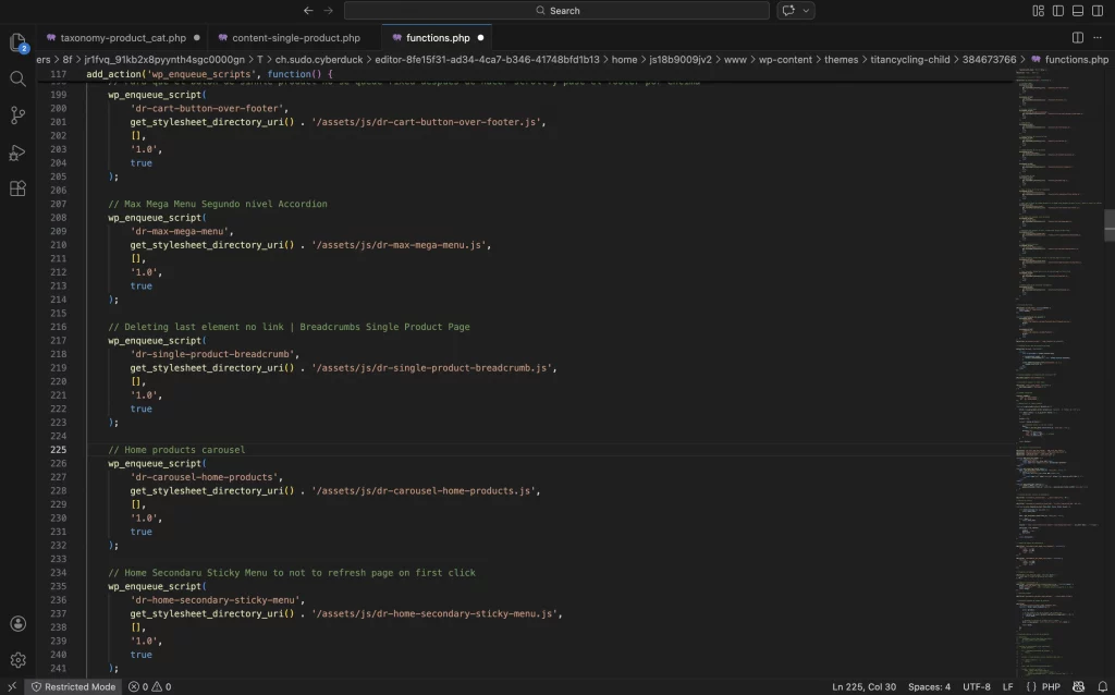
functions.php
Gestión estructurada de assets mediante wp_enqueue_scripts, asegurando carga condicional de JavaScript y control de versiones dinámico para evitar problemas de caché.
Separación clara entre estilos globales y scripts específicos por contexto (shop, categorías), optimizando rendimiento y mantenibilidad.
Menos plugins y más js
Desarrollo de lógica JavaScript personalizada para gestionar modales, filtros dinámicos y comportamientos sticky, mejorando interacción y experiencia en mobile.
Separación de responsabilidades entre presentación y comportamiento.
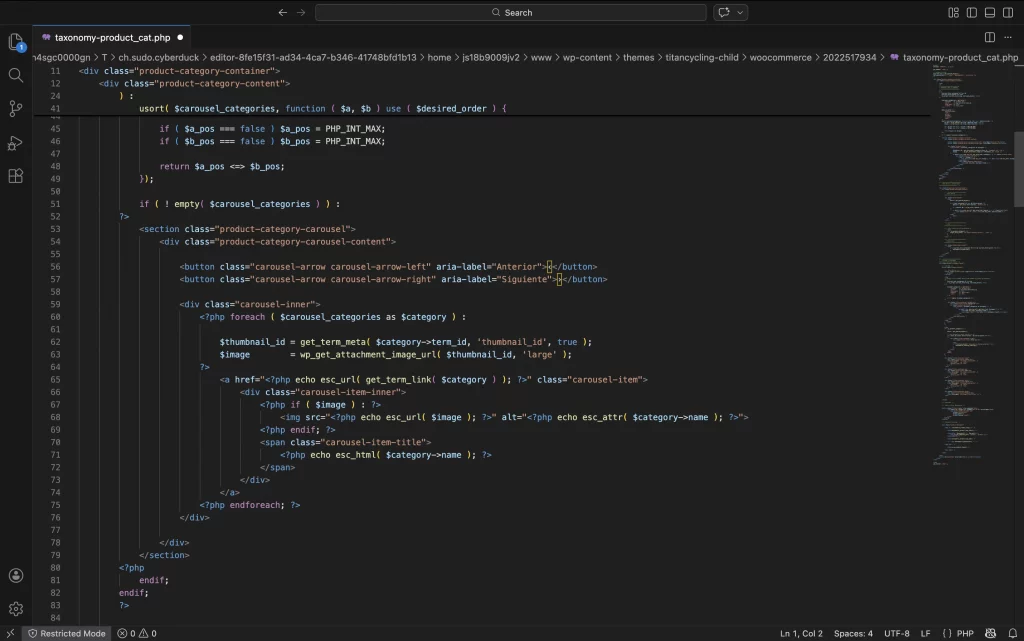
Template padre para products page
Implementación de plantilla específica para taxonomías personalizadas, permitiendo control total sobre jerarquía, filtros y estructura visual del catálogo.
Optimización del loop y consulta personalizada para mejorar rendimiento y coherencia de navegación.
Estructura de templates organizada
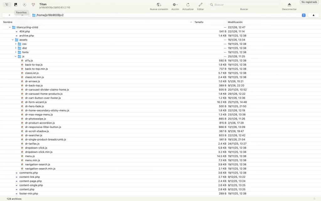
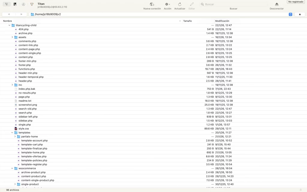
Desarrollo basado en tema personalizado estructurado de forma modular.
Separación clara entre templates, lógica PHP y assets (JS/CSS), facilitando mantenimiento y escalabilidad del proyecto.
Outcome Learnings