2026
Web (Desktop & Mobile)
La Mala Línea

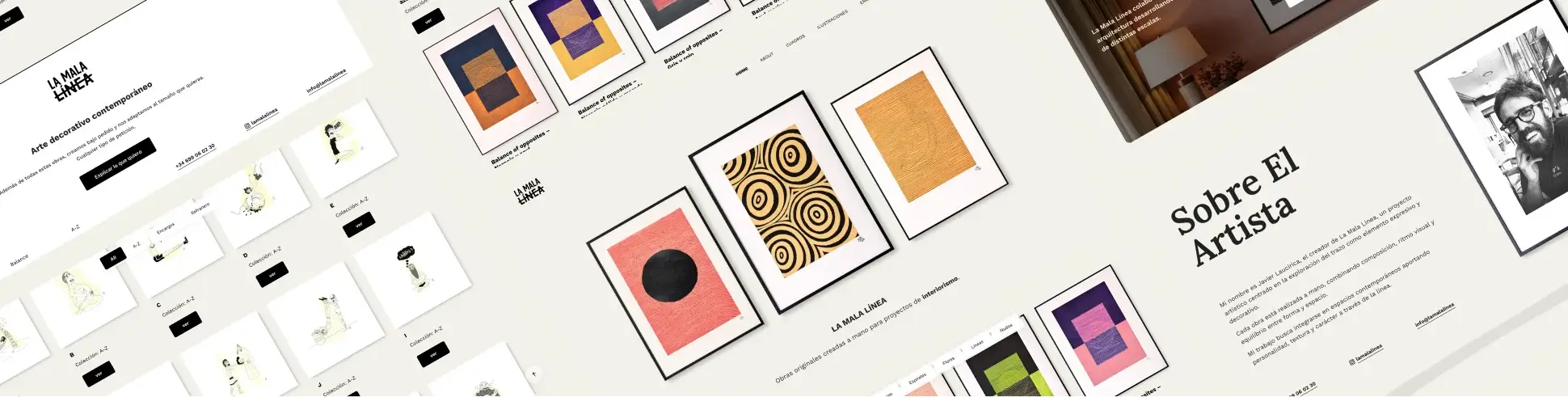
A carefully structured digital experience translating an artist’s vision into intuitive navigation, considered visual design and a custom-built WordPress system.

Stack
  • Type: Artwork Showcase
  • Role: UX/UI Designer · Web Designer · Developer
  • Scope: Information Architecture · UX/UI · Art Direction · Web Design · Development

01. Snapshot

Quick project overview, scope, role, and overall context
Intro

A digital experience designed around the way La Mala Línea wanted people to discover and connect with its work.


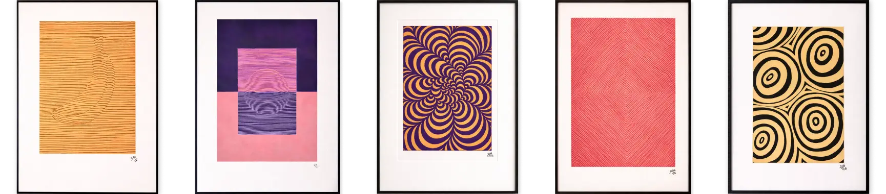
Instead of a conventional e-commerce experience, the website was structured to showcase paintings and illustrations, organize them through collections, promote commissions and collaborations, and turn interest in a specific piece into a direct conversation with the artist.


The project combined information architecture, visual direction, interaction design, and custom development to create a system that feels simple to use while remaining flexible and scalable underneath.

My Role

Product Designer · UX/UI · Frontend Development

  • Translated the client’s needs into a clear content and navigation architecture
  • Designed the user flows and interaction patterns around artwork discovery and enquiry
  • Developed the visual language and interface system in Figma
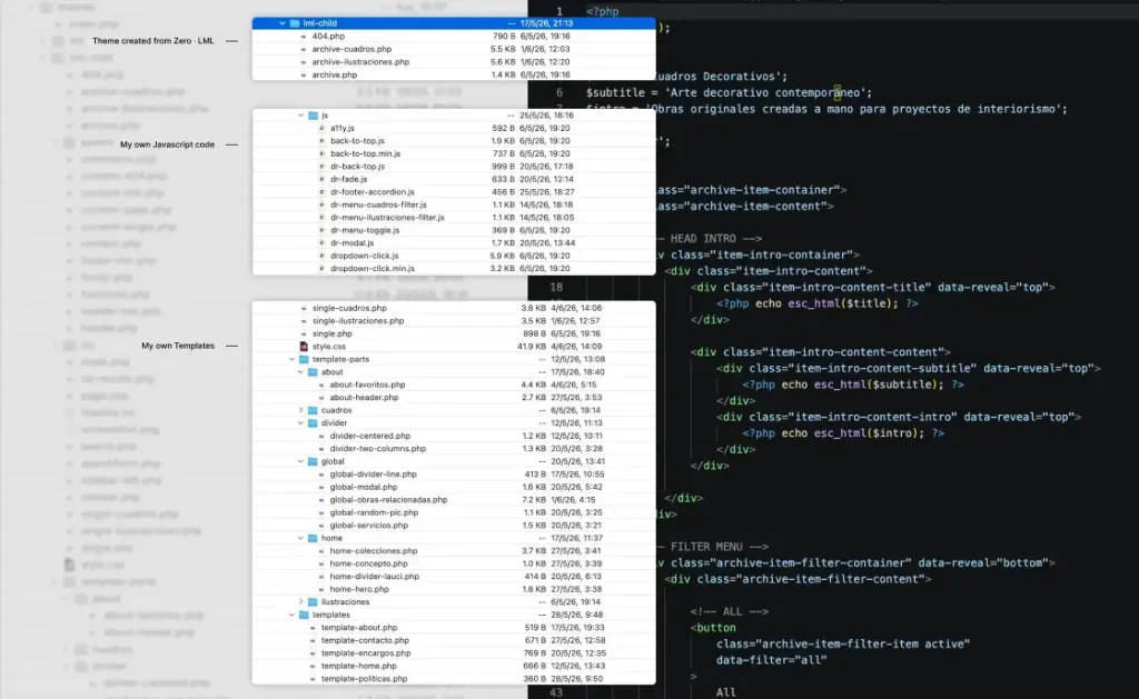
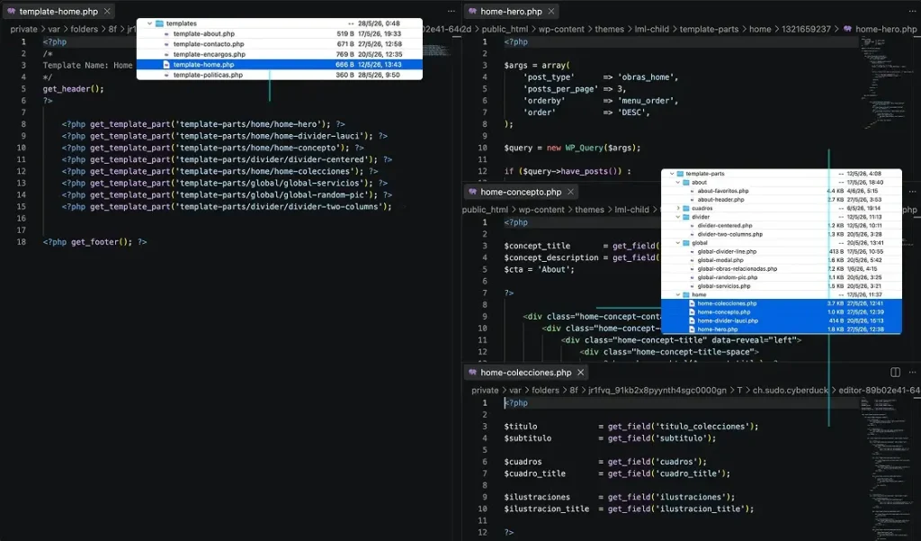
  • Built a custom WordPress theme with a structured template architecture
  • Developed the core functionality and interactions using PHP, JavaScript and CSS
  • Optimised the implementation for responsive behaviour and web performance

02. Context

Understand the project context, its constraints, and the goals to be achieved

The main challenge was translating the artist’s vision and business needs into a clear, intuitive digital experience that could showcase the work while encouraging direct contact.


The main objectives were to:

  • Showcase original paintings and contemporary illustrations
  • Organise the work through collections and distinct content types
  • Give visibility to commissions, reproductions and collaborations
  • Create a clear path from artwork discovery to enquiry
  • Allow the artist to curate and update the content as the studio evolves


The main constraint was intentional: the website was not designed as a conventional eCommerce platform. Rather than leading users towards an online purchase, the experience needed to encourage them to contact the artist directly and discuss the work personally.

ampliar

03. Thinking & Approach

Understanding the problem through research, insights, and validation

To define the experience, I analysed how contemporary artists, creative studios and curated art platforms present their work online.


The objective was not to replicate existing patterns, but to identify useful conventions around:

  • Artwork discovery and presentation
  • Collection-based navigation
  • Individual artwork pages
  • Artist storytelling
  • Enquiry and contact flows
  • Promotion of commissions and collaborations

This helped establish a balance between visual expression, familiarity and usability.
01 — The artwork should lead the experience

The interface needed to create enough structure to help users explore the work without competing with it visually.


02 — Interest should lead to conversation

The absence of conventional eCommerce was intentional. The website needed to turn interest in a specific artwork into a contextual enquiry, giving the artist the opportunity to discuss the piece, format, availability and price directly with the potential client.


03 — Content needed to remain flexible

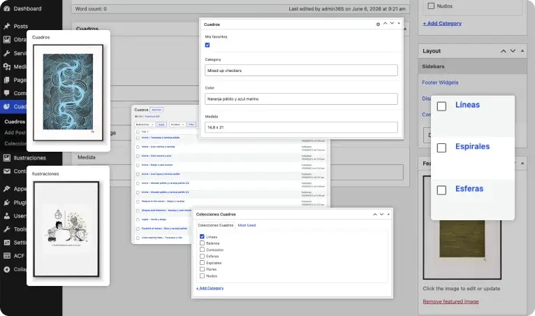
The artist should be able to continuously curate what appears across the website — from featured artworks on the Home to collections and related pieces — without changing the underlying structure.

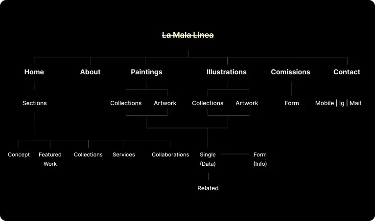
These insights translated into a content system built around:

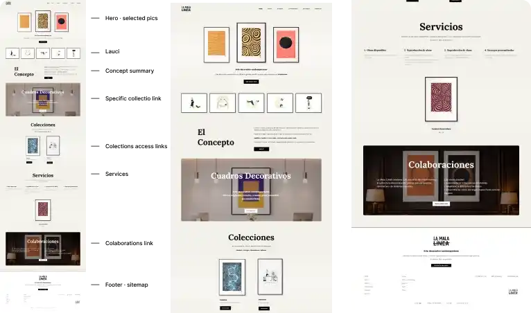
Home
→ Concept · Featured work · Collections · Services · Collaborations

About
→ Artist · Studio · Philosophy

Paintings / Illustrations
→ Collections · Artwork discovery

Artwork
→ Technical information · Enquiry · Related work

Commissions
→ Process · Requirements · Contact

Contact
→ Direct communication

The result was a structure where content, discovery and enquiry are connected rather than treated as separate sections.

04. Challenge / Solutions

Key issues identified and the design decisions made to address them
Challenge

The project introduced several structural and experience challenges:

  • The artist wanted to avoid conventional eCommerce, while still making artwork discovery and enquiries feel natural.
  • Paintings and illustrations required different collection structures without fragmenting the overall experience.
  • The Home needed to communicate the concept, artwork, collections, services and collaborations without becoming visually overloaded.
  • Users needed a clear path from discovering an artwork to enquiring about that specific piece.
  • The artist needed to curate featured work and content without depending on development changes.
  • The visual identity relied on simplicity, typography and small interaction details, leaving little room for unnecessary interface elements.

Solution

The experience was designed as a connected, curated system:

  • Collection-based navigation to organise and explore paintings and illustrations.
  • Contextual artwork pages connecting technical information, related work and enquiry.
  • A curated Home structure balancing storytelling, artwork, services and collaborations.
  • Context-aware enquiry forms that pass the artwork title, collection and relevant information to the artist.
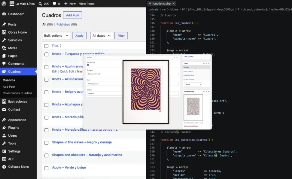
  • A flexible WordPress content structure allowing the artist to control featured works and content.
  • A deliberately minimal visual and interaction system, where typography, spacing, transitions and the signature line become part of the experience.

05. Core Experience Design

How the product is structured, navigated, and experienced from the user’s perspective

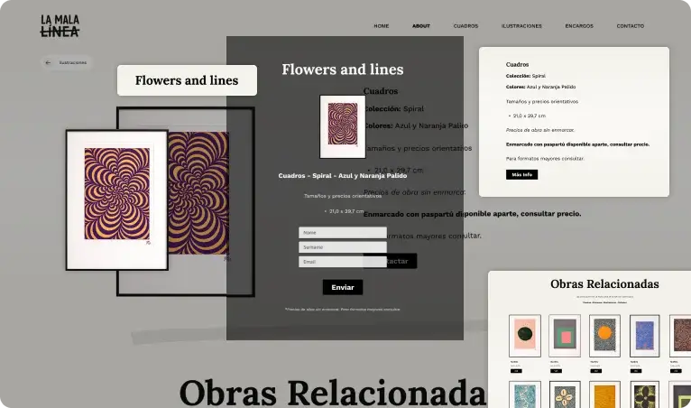
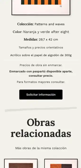
The individual artwork page was designed as more than a product detail page.

It brings together:

Artwork → Technical information → Collection → Enquiry → Related work

The visual presentation gives the piece enough space to remain the protagonist, while the accompanying information provides the context needed to understand the work.

The related-work section then creates a natural continuation of the browsing experience rather than leaving the user at the end of a single page.

Because the artwork is the core of the experience, navigation needed to remain simple, visible and contextual.

Collection navigation was integrated directly into the artwork archives, allowing users to move between different collections without having to repeatedly return to a higher-level page.

Related artworks and curated selections provide additional paths through the catalogue, encouraging exploration without introducing a complex filtering system.

The navigation therefore works at two levels:

Global navigation → move between the main areas of the studio
Contextual navigation → explore collections and related artwork

The enquiry flow was designed around the artist’s decision not to use conventional eCommerce.

Instead of:

Artwork → Add to cart → Checkout

the experience becomes:

Artwork → Interest → Enquiry → Direct conversation

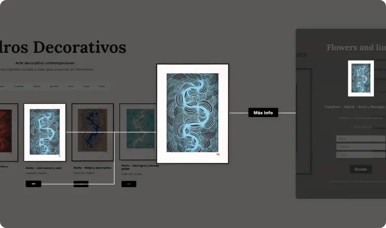
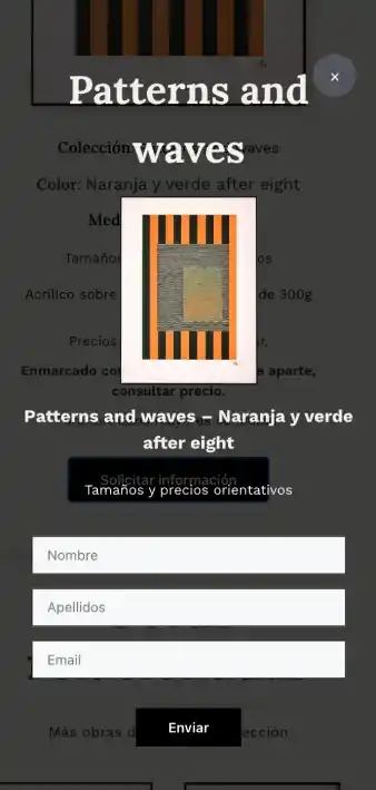
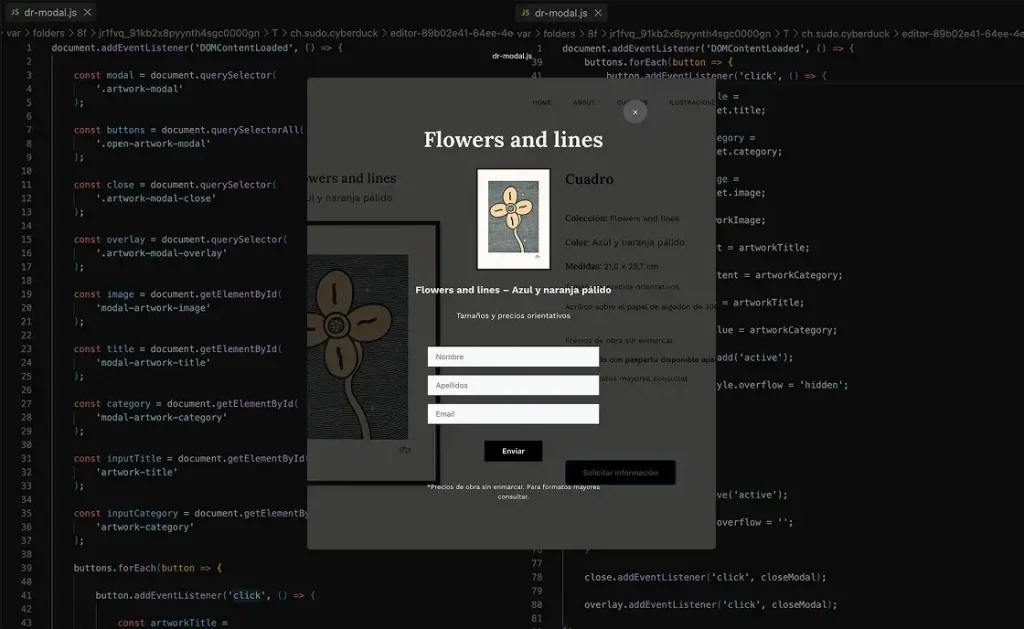
The CTA on an individual artwork opens a contextual form, already associated with the piece the user was viewing.

The submitted information is sent to the artist together with the artwork title, collection and relevant details, giving the artist enough context to continue the conversation directly.

The experience was designed to remain curated rather than static, allowing the artist to decide which pieces should gain more visibility across different parts of the website.

Artwork is not limited to a single archive. Individual pieces can become part of collections, appear as featured work on the Home, be selected as artist favourites, or be suggested as related work within individual artwork pages.

This creates multiple paths for discovery while keeping the experience intentionally curated.

Artwork → Collections → Featured Work → Related Work → Discovery

Rather than relying on automated recommendations, the system gives the artist control over what is promoted, allowing the website to evolve alongside new work, availability, exhibitions, sales, or changing creative priorities.

This turns the website into an active extension of the studio rather than a static catalogue.

06. Visual

Quick project overview, scope, role, and overall context

Visual Identity

A minimal visual system focused on clarity and contrast, allowing content and structure to drive the experience.
Minimal color system focused on contrast and readability, allowing content to take priority over visual hierarchy.
primary color #F3F1EA
secondary color #000

Interface Screens

How the platform is navigated and experienced in real use

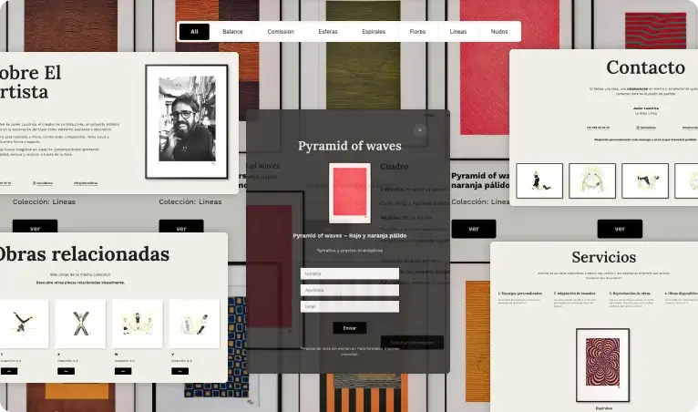
A curated introduction to the studio

The homepage progressively introduces La Mala Línea through its concept, artwork, collections, services and collaborations, creating a visual narrative that guides users through the studio and its work.

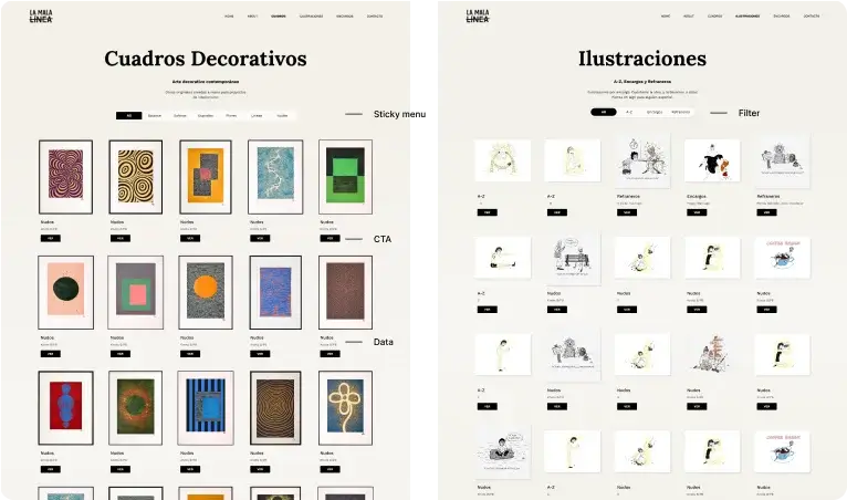
A visual catalogue built for exploration

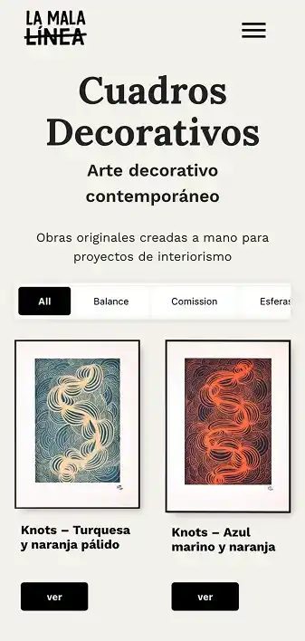
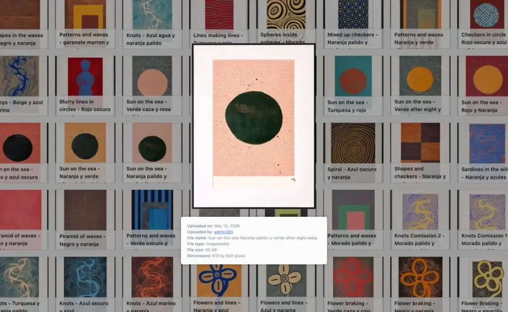
The paintings and illustrations archives make a growing body of work easy to browse while maintaining a consistent visual language across both types of content.

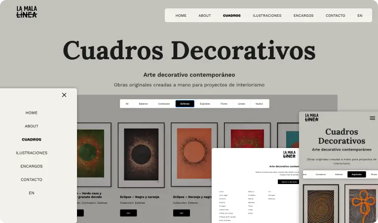
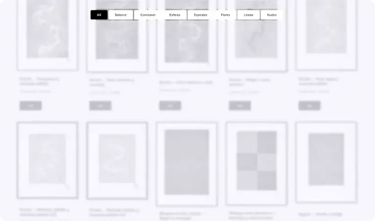
Making collections immediately accessible

Collection navigation allows users to move between different bodies of work without losing context, creating a simple and intuitive way to explore the catalogue.

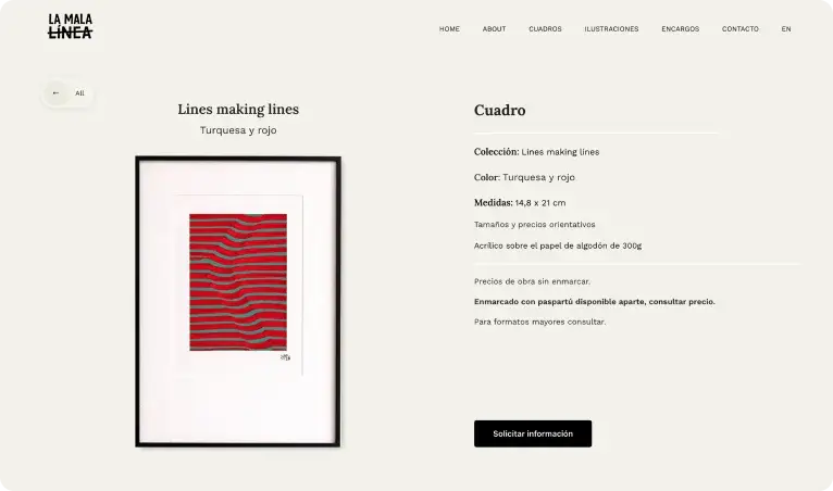
Giving each piece space and context

Individual artwork pages balance the visual presence of each piece with the information needed to understand it, enquire about it and continue exploring related work.

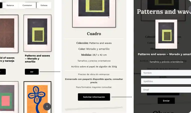
Turning interest into a direct conversation

The enquiry experience connects a user’s interest in a specific artwork with a direct conversation with the artist, keeping the artwork as the context throughout the interaction.

Extending the experience beyond the artwork

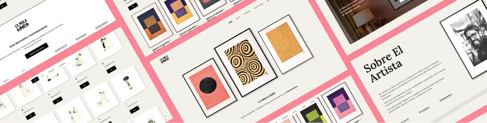
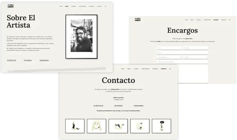
The same visual language extends across the artist profile, commissions and contact experience, creating a coherent studio identity beyond the artwork catalogue.

07. Responsive Design

Adapting the experience across different devices without compromising clarity or usability

Designing a consistent experience across screen sizes

The responsive system was designed to preserve the visual identity, hierarchy and usability of La Mala Línea across desktop, tablet and mobile, adapting layouts and interactions rather than simply scaling them down.

08. Technical Implementation

How design decisions translated into a scalable and maintainable system

09. Outcome / Learnings

Key issues identified and the design decisions implemented to resolve them
Outcome
  • Clear artwork discovery across collections
  • Direct connection between artwork interest and enquiry
  • Flexible and scalable content system
  • Consistent visual language across the experience
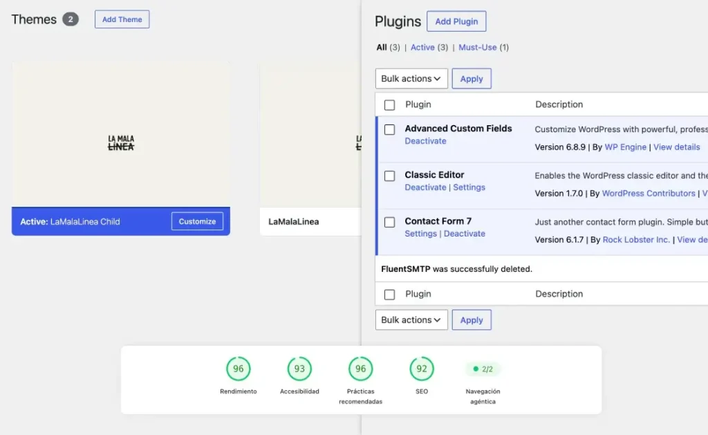
  • High performance with minimal dependencies
Learnings
  • Understanding the client’s needs should come before designing the interface
  • Simplicity is the result of good structure
  • Small details have a significant impact on perceived quality
  • Design and development work best as one process