2024
Web App | Internal Tool | SaaS
Pans & Co

A modular intranet system that centralizes operational workflows and internal collaboration, improving efficiency, clarity, and access to critical information.

Stack
  • Type: Internal Platform · Workforce Management · Communication System
  • Role: Product Designer (UX/UI)
  • Scope: Information Architecture · Role-based UX · Interaction Design · Component System · Dashboard Design · UX Strategy

01. Snapshot

Quick project overview, scope, role, and overall context
Intro

A role-based intranet platform designed to centralize communication, shift management, and learning resources for distributed restaurant teams.


The system integrates operational tools and community features into a single interface, improving daily workflows, internal communication, and employee development.


My role involved defining the information architecture, designing key interaction flows, and building a consistent UI system adapted to different user roles (staff and managers).

My Role

Before the design phase, the project started with a set of structural and functional challenges:

  • No centralized platform to manage communication, scheduling, and training.
  • Fragmented workflows across multiple tools and informal channels.
  • Lack of clear hierarchy between operational and social features.
  • Different user roles (staff vs managers) with distinct needs.
  • High dependency on real-time information for daily operations.

The project required defining a unified system capable of supporting both operational efficiency and internal communication within a single platform.

02. Context

Understand the project context, its constraints, and the goals to be achieved

Before the design phase, the project started with a set of structural and functional challenges:

  • No centralized platform to manage communication, scheduling, and training.
  • Fragmented workflows across multiple tools and informal channels.
  • Lack of clear hierarchy between operational and social features.
  • Different user roles (staff vs managers) with distinct needs.
  • High dependency on real-time information for daily operations.

The project required defining a unified system capable of supporting both operational efficiency and internal communication within a single platform.

ampliar

03. Research / Analysis

Understanding the problem through research, insights, and validation

To define the product structure and interaction patterns, a benchmarking analysis was conducted across three main categories:

  • Workplace communication tools (Slack, Microsoft Teams)
  • Learning platforms (Udemy, Coursera)
  • Scheduling and workforce management tools

The objective was to identify proven interaction models and adapt them into a unified system tailored to restaurant operations.

Key insights extracted:

  • Channel-based communication improves clarity and reduces noise in team interactions.
  • Progressive disclosure helps manage complex information without overwhelming the user.
  • Clear hierarchy and visual states are essential for fast navigation in operational tools.
  • Role-based interfaces allow the same system to adapt to different user needs.
  • Dashboard summaries are effective only when built on top of well-structured underlying sections.

The product is structured as a modular system where each section solves a specific operational need while maintaining consistency across navigation and interaction patterns.

Each module (Schedule, Chat, Learning, Dashboard) follows a predictable structure, reducing cognitive load and enabling fast access to relevant information.

Navigation is persistent and role-based, adapting to different user types while preserving a consistent experience across the platform.

04. Challenge / Solutions

Key issues identified and the design decisions made to address them
Challenge
  • Combine communication, scheduling, and learning into a single platform without creating complexity.
  • Design for different user roles with distinct permissions and workflows.
  • Ensure fast access to time-sensitive information (shifts, messages, alerts).
  • Avoid cognitive overload in content-heavy sections.
  • Create a scalable system adaptable to future features.
Solution
  • Modular architecture separating core functionalities (Chat, Schedule, Learning, Dashboard).
  • Role-based interface adapting navigation and features depending on user type.
  • Channel-based communication system for structured conversations.
  • Clear information hierarchy with progressive disclosure patterns.
  • Dashboard designed as a summary layer aggregating key information from all sections.

05. Visual

Quick project overview, scope, role, and overall context

Visual Identity

A minimal visual system focused on clarity and contrast, allowing content and structure to drive the experience.
A functional color system designed to support hierarchy, readability, and interaction. Neutral backgrounds reduce visual noise, while the primary accent color highlights actions and active states. Supporting tones are used for structure, feedback, and clear content separation.
background.primary #fefefe
surface.highlight #f4ea67
action.primary #ffee0c
structure.secondary #383835
structure.primary #22221f
feedback.error #fa0000

Components

Core product components designed to support navigation, readability, and interaction across long-form case studies

Interface Screens

How the platform is navigated and experienced in real use

On this screen, once registered, users will find the inputs needed to access their profile:

  • Employee ID or email
  • Password

If users have not registered yet or have forgotten their password, they can access the registration or password reset screens.

Logically, this is the first screen a new user will see. Without going through this step, they would never access the rest of the sections, including login.

It consists of three inputs where the user must enter:

  • email
  • password
  • password confirmation

This ensures the password is entered correctly.

This is a screen that ideally users will rarely need, only if they forget their password.

Similar to the previous screen, but without the email input, users must enter a new password and confirm it.

At the top, we have a filtering area where we can view the employee calendar daily, weekly, or monthly.

It also displays the number of hours worked during the current month up to today (127 hours).

We can also find buttons to print or create a copy of the current screen. In addition, users can access any specific day in the intranet using the filter.

The section displays a table where we can see the different staff members along with information indicating

  • the tasks performed daily
  • the shift assigned
  • the total hours worked during the selected time period

From a global perspective, we can see the full screen with the sidebar section selected, clearly indicating where the user is located.

In this section I wanted to combine two points requested in the brief into a single feature. These Project Goals merged into the same section are:

  1. Build an online community where users can communicate and share their knowledge and activities related to work and non-work topics
  2. Build a platform where the crew-member can access relevant and updated information to ease their daily tasks.

From my perspective, the key was to create a chat with multiple channels, where users could talk about different topics — both work-related and non-work-related.

Share their knowledge and activities for work and non-work related topics.

Staff

Here we can see categories that concern everyone, such as #Vacations, #Shifts, #Rules. The #Welcome channel is currently being used to welcome a new employee, María Soria, in this example.

Fundays

This channel is used for non-work topics, such as:

  • Christmas or summer celebrations
  • After-work events
  • Coordinating vacations

Community

Crew-member can access relevant and updated information to ease their daily tasks.

In this channel, all staff members can find useful information about daily activities, clarify doubts, and quickly ask colleagues questions through the chat.

In the central area, we have the chat conversation.
At the bottom, there is the input field where users can write messages or attach images.

On the right side, there is a list of staff members and managers showing their current status: online or offline.

In the full screen view, we can see that the Chat section in the sidebar is active, indicating the user’s current location.

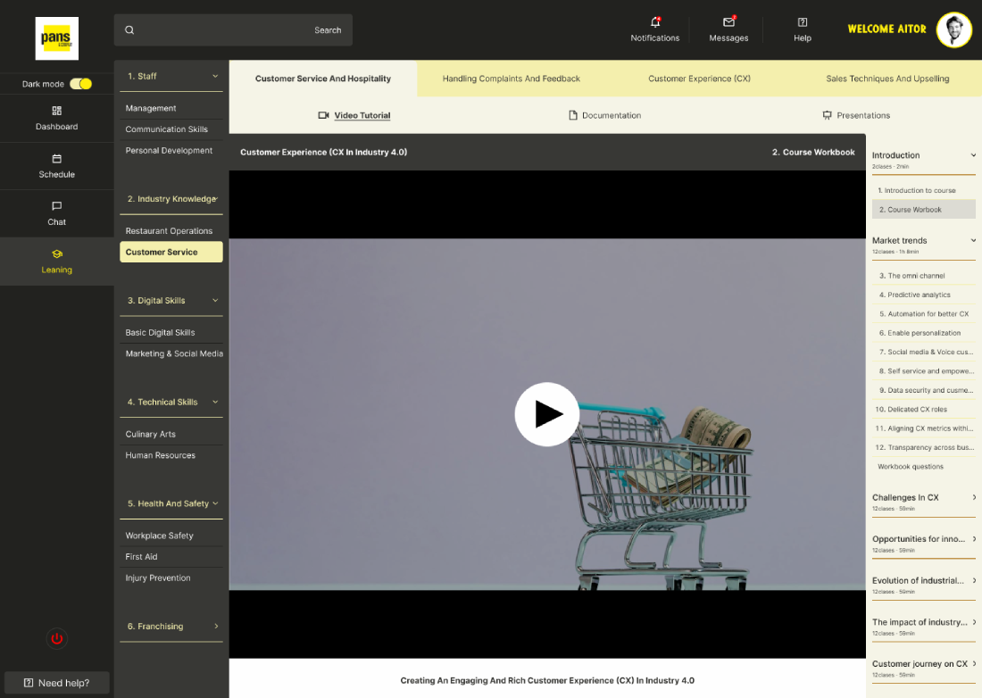
For this section I took as a reference a platform from which I have learned many programming and design concepts: Udemy.

I really like this platform because of how it distributes information and content, making it easy to remember where you are in a course and quickly find what you are looking for after completing it.
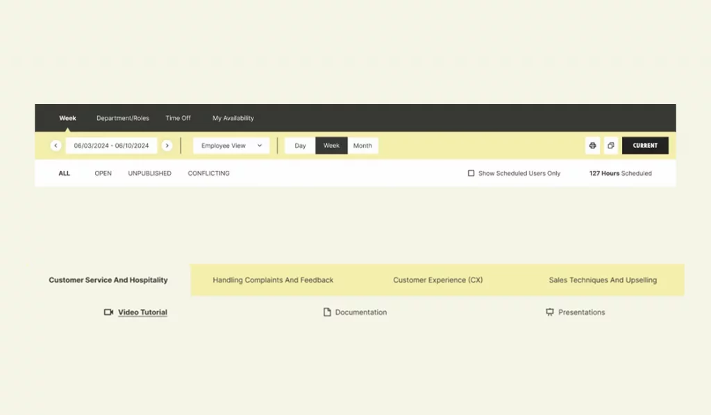
Top area

At the top, users choose one of the four main topics included in the course.

Once we select one (for example Customer Service and Hospitality), we can choose how we want to view it:

  • Video tutorial
  • Documentation
  • Presentation

Left area

Once the topic is selected, we can see the different sections.

Within each section there are 2 or 3 sub-areas.

In this example, we are inside Industry Knowledge, viewing the chapter Customer Services, which is highlighted with a yellow background to indicate it is the active section.

Right area

Inside the selected chapter (Customer Service), we find all the sections that compose it.

In this case, we are currently in the course introduction within Course Workbook.

This section is special because only users registered with the Manager role can access it.

In this section, the manager can communicate directly with any staff member.

In the sidebar, we see a new element that does not appear in the previous examples (which corresponded to staff profiles): “Manager”.

When entering the Manager section, we find a different chat interface where there are no topic channels, but instead a list of staff members on the left.

On the right side, we find general employee information and links that allow the manager to:

  • send an email
  • call the employee by phone

In the center we see the chat messages, and at the bottom there is a message input similar to the previous one but with some differences, such as the ability to send private messages.

This section is the main screen that a staff member will see after logging in. It summarizes information from the previous sections.

Here we can find:

  • summary of the shifts scheduled for that day
  • unread messages and notifications
  • calendar with relevant information such as birthdays, vacations, events, or supplier meetings

We can also find new training videos or the last video watched, allowing users to continue from where they left off.6. Login, Register, Reset password & Flow

06. Outcome / Learnings

Key issues identified and the design decisions implemented to resolve them
Outcome
  • A modular intranet platform that centralizes communication, scheduling, and learning into a single system.
  • The solution improves operational efficiency, reduces fragmentation across tools, and enables faster access to relevant information for both staff and managers.
  • The role-based structure allows the platform to adapt to different user needs while maintaining a consistent and scalable experience.
Learnings
  • Designing internal tools requires prioritizing clarity and speed over visual complexity.
  • Modular systems enable scalability while keeping interfaces predictable and easy to navigate.
  • Role-based experiences are essential when different users interact with the same product in fundamentally different ways.
  • Benchmarking is most valuable when translated into patterns and insights, not just references.