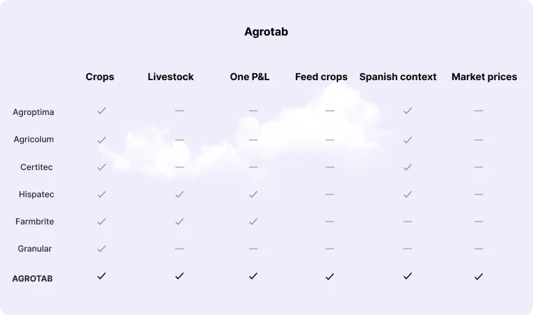
I compared [5] tools Spanish farmers use. Crop apps ignore livestock. Livestock apps ignore crops. Full farm ERPs cover both, but at a price and complexity a family farm can’t justify.
None of them treats the farm as one business.
Turning 20 years of scattered farm data into a SaaS decision tool for mixed agriculture and livestock operations
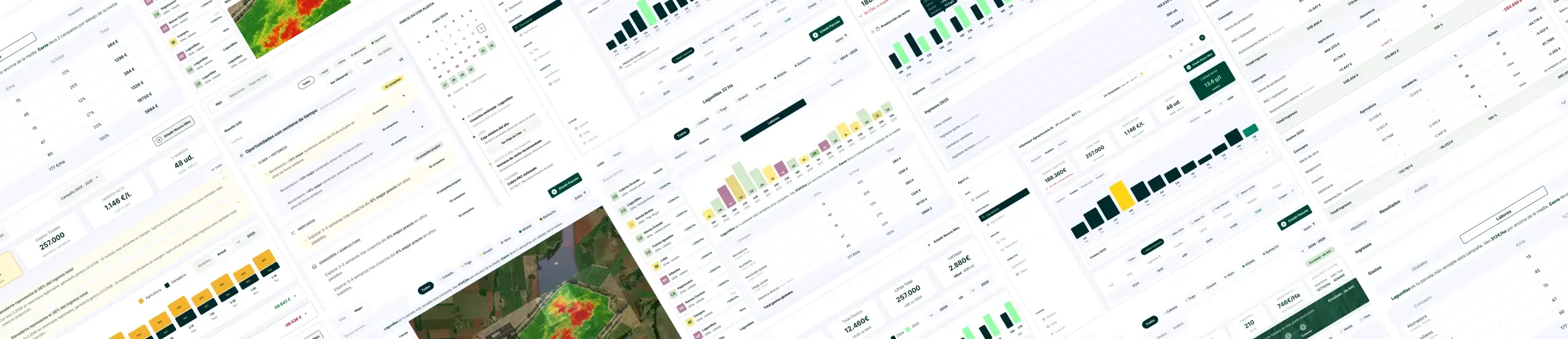
AGROTAB is a management app for mixed farms: crops and livestock in one place. It started with my own operation in Zamora: 624 ha across 29 parcels, dairy sheep, and eight seasons of records scattered across spreadsheets.
The operation had strong operational history but weak decision visibility:
The project focused on transforming disconnected records into a system built around one principle: every data point shown must connect to a concrete action.
Product Designer, end to end:
Product strategy & research · Information architecture for 10+ modules · UI design in Figma · Database design (Supabase, 22 tables) · Front-end in React Native
Crop records, costs, livestock data and subsidies lived in different files. Answering «which parcel actually makes money?» meant hours of spreadsheets.
No existing tool combined crops and livestock in a single P&L at a price a mid-size farm can pay.
I compared [5] tools Spanish farmers use. Crop apps ignore livestock. Livestock apps ignore crops. Full farm ERPs cover both, but at a price and complexity a family farm can’t justify.
None of them treats the farm as one business.
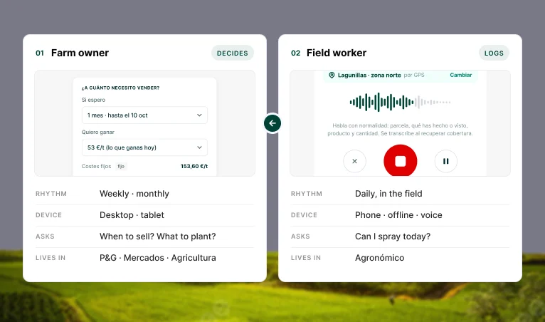
Direct research with the two people who use this data daily surfaced two different needs under one roof:
01 — The real question is economic, not agronomic
The farmer doesn’t need more field data. They need to know if the operation is profitable and when to sell.
02 — Costs aren’t equal across parcels
A parcel with more tractor passes and more input has a completely different real cost. Distributing costs evenly gives the wrong break-even point.
03 — Data only has value when cross-referenced
NDVI alone says nothing. NDVI + historical yield + weather + real cost is what makes a decision actionable.
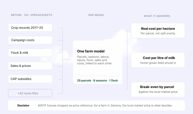
Before any screen was designed, a unified data model was built from 50+ scattered spreadsheets to identify what actually determines profitability — real cost per hectare, cost per litre of milk, break-even by parcel.
MATIF futures aren’t a useful price for a farm in Zamora, so the Markets module moved to local market prices.
 Challenge Solution
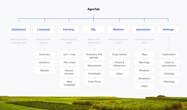
 The experience is structured around the real questions each user asks, not around the data categories that existed before:
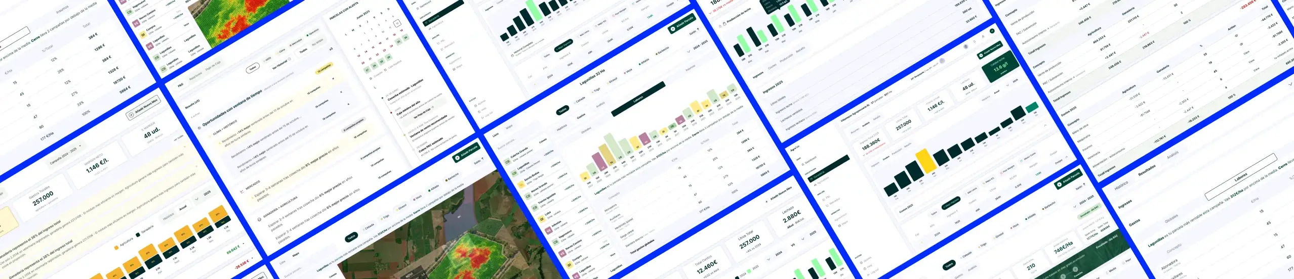
Dashboard → Agricultura → Ganadería → P&L → Mapa → Mercados → Agronómico.
Each module maps to one question — «what do I need to know right now,» «where’s my break-even,» «when should I sell» — keeping the system scalable as new data sources are added.
Two distinct usage patterns shaped the architecture: the farm owner needs consolidated financial visibility to decide when to sell and what to plant, while the field worker logs labor daily and checks weather in real time to decide on treatments. Designing for both meant separating strategic (financial) and operational (field) views without duplicating data entry.
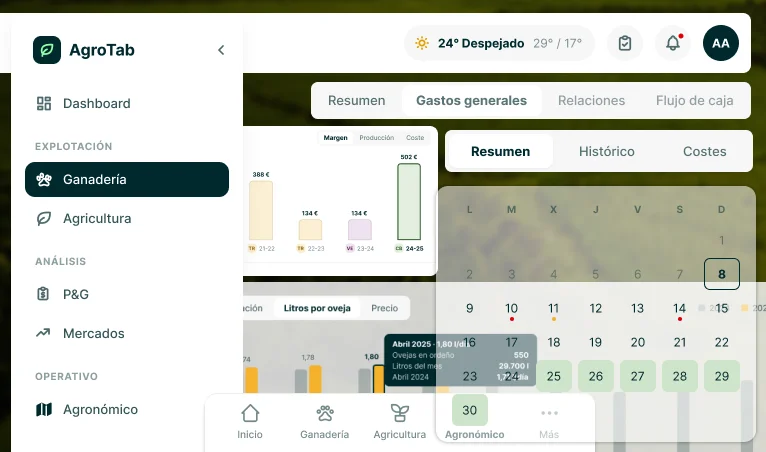
Four data dimensions across 20 years of history was the hardest interaction problem in the product. The solution separates two independent axes — the dimension being analyzed and the time period — so any historical comparison takes two clicks instead of a rebuilt view each time.
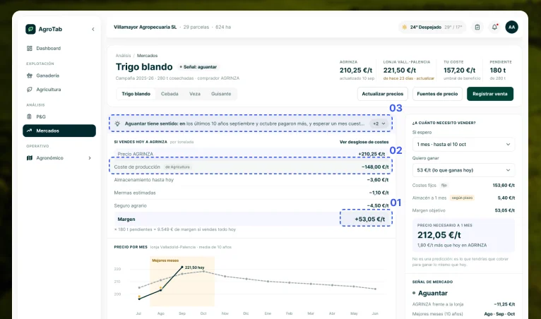
The Mercados module connects local market price to real production cost per parcel, generating an explicit sell/hold signal instead of a raw price feed — the one thing no existing tool in the category does.
Seasons, calendar years or custom dates
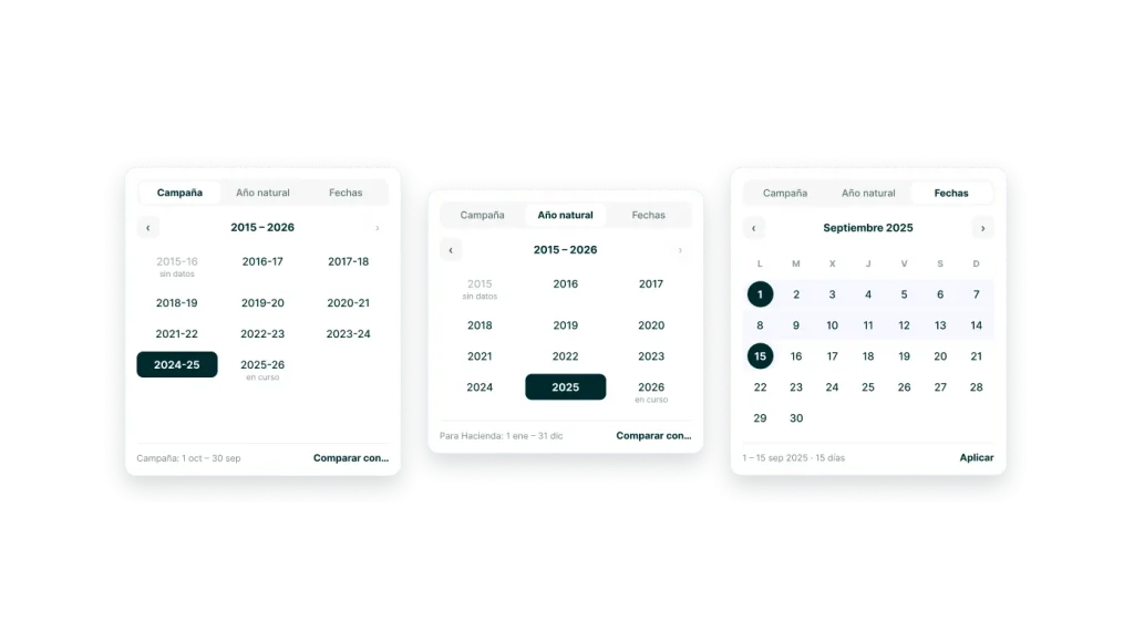
Farm data doesn’t follow the calendar year: a season runs from October to September. The selector switches between season, calendar year and custom dates, marks seasons with no data or still in progress, and offers «Compare with…» in the same place. One shared component means any module can be compared across 20 years the same way.
Toast, banner, modal: one rule for each
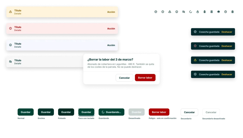
Three patterns with one clear rule: a toast reports the result of an action, a banner shows a state that is still true, and a modal asks for a decision. Errors never close on their own and always say what to do next. «Saved» toasts include Undo, so the user can act fast without fear.
Read is not resolved
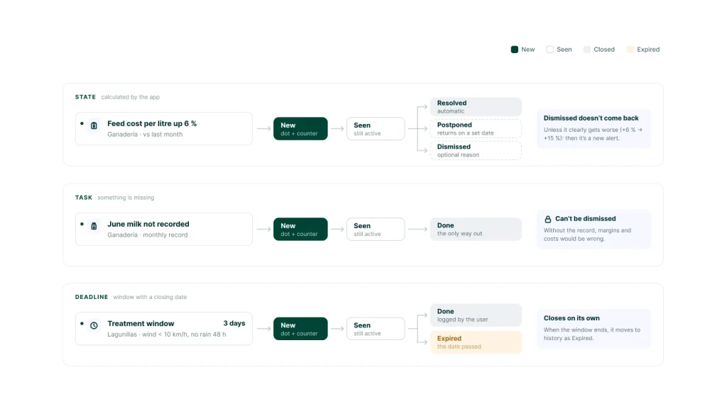
Alerts are split by type: state alerts (calculated by the app), task alerts (something left to do) and deadline alerts (a treatment window). Each disappears in its own way: resolved, done, expired, dismissed or postponed. Reading an alert only removes the dot; it stays active as long as it is still true.
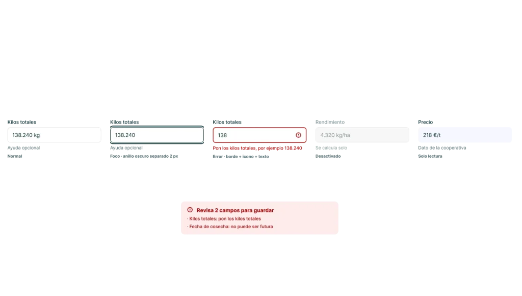
Errors that explain how to fix them
Every field covers normal, focus, error, disabled and read-only states, with units built in (kg, €/t) and an Auto/Manual label when a value is calculated. Errors appear on leaving the field, not while typing. With two or more errors, a summary at the top links to each field.
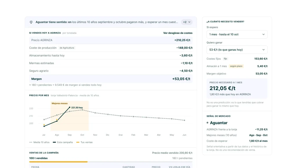
From price to margin per tonne
Instead of a raw price feed, the cooperative price is broken down into production cost, storage, losses and insurance down to the real margin per tonne. The calculator answers the reverse question: what price do I need if I wait a month? It is clearly labelled as a calculation, not a prediction.
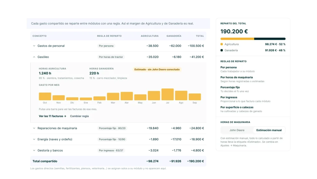
One cost, split between crops and livestock
Shared costs like labour, fuel or machinery are listed once and split into Crops and Livestock columns. Each row expands to show who, how much and how it was allocated, so shared costs are traceable without duplicating any entry.
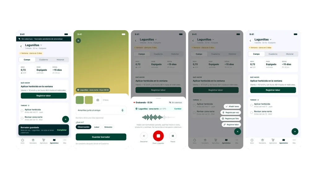
Voice, photo, offline
Built for the field worker: GPS detects the parcel, a voice note records what was done, and everything is saved as a draft without coverage, to be transcribed later. Logging labour takes seconds, not a form.
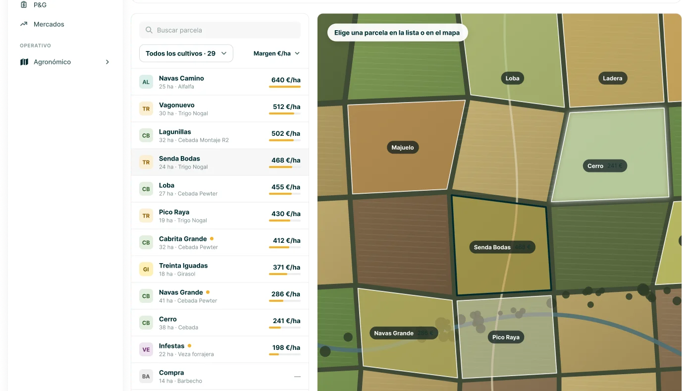
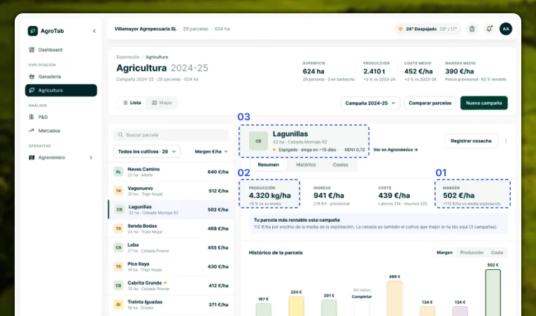
Challenge: 29 parcels and eight seasons of records made it impossible to know which parcel actually made money.
Solution: A master-detail view: the parcel list sorted by margin on the left, the selected parcel on the right with production, income, real cost and margin, its history across seasons, and which crop has performed best there.
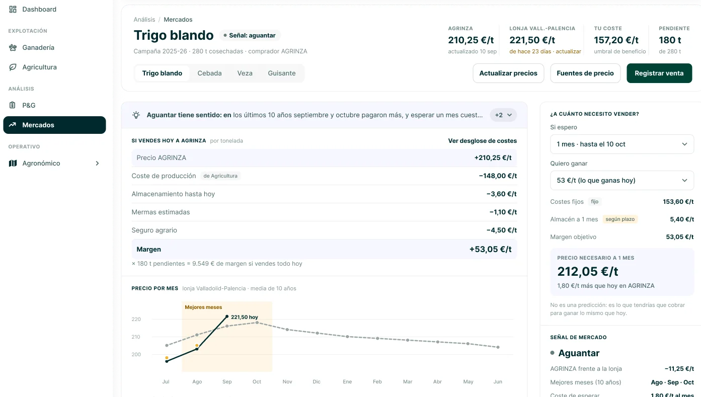
Challenge: A price on its own doesn’t tell you whether to sell. MATIF futures weren’t even a useful reference for a farm in Zamora.
Solution: Cooperative price, local market price and real production cost side by side, an explicit sell/hold signal, the 10-year monthly price pattern and the season’s sales against the market.
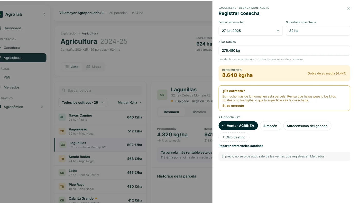
Challenge: One wrong figure in the harvest distorts yield, margin and every comparison that follows.
Solution: A short form that calculates yield automatically, warns when kilos fall outside the parcel’s usual range without blocking the user, and confirms with Undo.
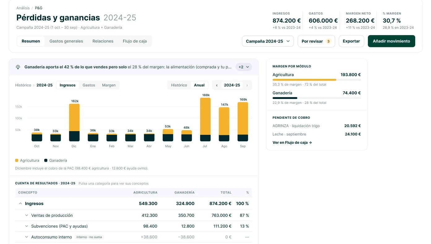
Challenge: Crops and livestock were managed as two businesses, with no single view of profit.
Solution: One P&L for the whole farm, with crops and livestock as columns of the same statement and home-grown feed recorded as an internal sale, so each side shows its real cost.
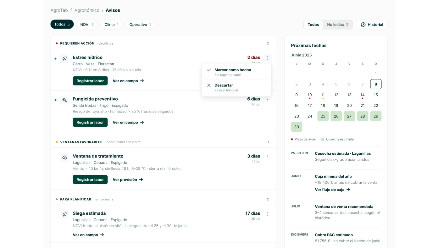
Challenge: Weather, crop health and market alerts were scattered or didn’t exist.
Solution: One prioritised list where colour appears only when it means something, deadlines are aligned so they can be scanned, and every alert leads to an action.
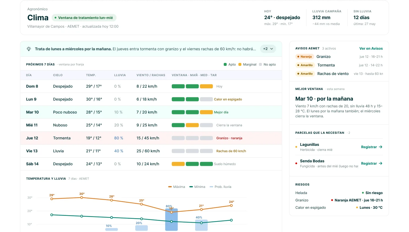
Challenge: Treatments depend on wind and rain in the next hours, not on a generic forecast.
Solution: A widget always available from the header, opening an hourly view tied to the farm’s location.
Outcome Learnings 
Behavior-driven earning platform redesigned to increase activation, retention, and user trust through structured progression and friction reduction.

A product design challenge exploring how a complex document management and BIM experience could be adapted for mobile and tablet…

Redesign of a complex government platform focused on improving accessibility, navigation, and trust for a diverse user base. Transforming fragmented…