2024
Social Security

Redesign of a complex government platform focused on improving accessibility, navigation, and trust for a diverse user base. Transforming fragmented information into a clear, structured, and accessible user experience.

Stack
  • Type: Public Service · Government Platform · Information-Heavy System
  • Role: UX/UI Designer · Research · Information Architecture
  • Scope: Research · Benchmarking · Heuristic Analysis · IA · Navigation · Accessibility · Interaction Design

01. Snapshot

Quick project overview, scope, role, and overall context
Intro

A redesign focused on improving how users access, understand, and navigate complex administrative information within a critical public service platform.


The project combines research-driven insights with structural redesign to simplify access to essential public services.

My Role

UX/UI Designer

  • Conducted user research and heuristic analysis.
  • Defined information architecture and navigation model.
  • Designed key interaction patterns and interface components.
  • Developed wireframes and high-fidelity prototypes,

02. Context

Understand the project context, its constraints, and the goals to be achieved

The Spanish Social Security website contains a large volume of services and procedures, but its current structure makes it difficult for users to find information, complete tasks, and trust the system.

ampliar

03. Research / Analysis

Understanding the problem through research, insights, and validation

A mixed-method study was conducted with 116 participants, complemented by qualitative interviews.

Key findings:

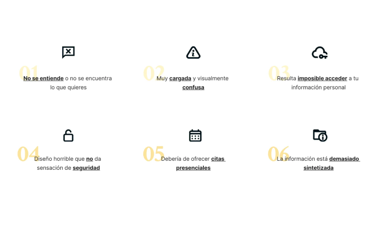
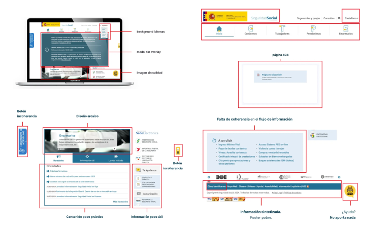
  • Nearly 70% of users struggle to find what they are looking for
  • 34% experience frustration with digital identification systems
  • Most users access the platform via desktop
  • Users feel uncertain about processes and required steps

Three key user profiles were identified:

  • Frequent users struggle with efficiency and navigation feedback
  • Foreign users face language and comprehension barriers
  • Non-digital natives experience high cognitive load and difficulty completing tasks

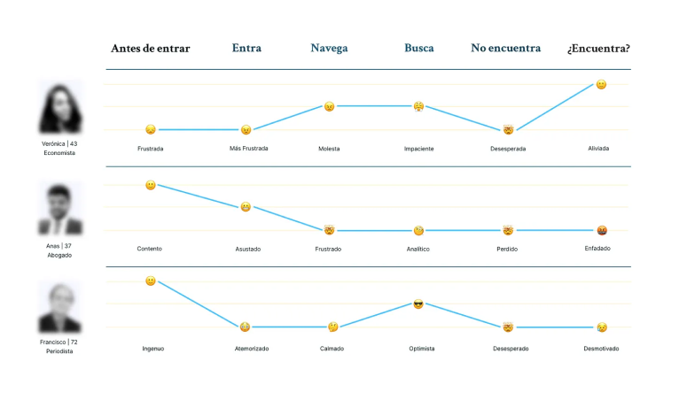
The user journey revealed consistent friction across all stages, from entry to task completion, with increasing frustration leading to abandonment.

Key design decisions were driven by research insights, focusing on reducing complexity, improving navigation, and increasing user trust.


Initial research focused on identifying recurring user concerns through search queries and public sources.


Common issues included difficulties in booking appointments, contacting support, accessing personal information, and understanding where to start.


These patterns indicate a lack of clear entry points and insufficient guidance across the platform.

A heuristic evaluation was conducted to identify usability issues across the current interface.

Key problems identified:

  • Lack of visibility and feedback in navigation
  • Inconsistent visual hierarchy and outdated UI
  • Poor content organization and information overload
  • Critical actions hidden or difficult to access
  • Absence of proper loading, error, and system feedback states

These issues directly impact usability, efficiency, and user trust.

A comparative analysis of international government platforms (e.g. GOV.UK, Switzerland, Germany, Sweden) revealed consistent patterns:

  • Clear and structured information architecture
  • Prominent and effective search systems
  • Use of mega menus for complex navigation
  • Consistent visual systems that reinforce trust
  • Simplified and accessible language

Key insights:

  • Users struggle more with navigation than with task execution
  • The platform lacks clear entry points, forcing users to rely on trial and error
  • Language and accessibility are critical barriers
  • Visual inconsistency negatively affects trust
  • Simplifying structure has a greater impact than adding new features

04. Challenge / Solutions

Key issues identified and the design decisions made to address them
Challenge
  • Users struggle to find the right entry point to start a process.
  • Navigation lacks clarity, making it difficult for users to understand where they are or where to go next.
  • The platform presents a large volume of information without proper organization, creating cognitive overload.
  • Language and accessibility barriers prevent a significant portion of users from understanding and completing tasks.
  • Users rely heavily on search due to poor navigation, but the current search system is not prominent or effective.
  • Inconsistent visual design and outdated UI reduce user trust in a platform that handles sensitive information.
Solution
  • Defined a clearer information architecture with prioritized entry points and task-oriented navigation.
  • Introduced a structured navigation system with mega menu, visual hierarchy, and navigation feedback (visited states and contextual cues).
  • Reorganized content into clear categories and progressive layers, reducing complexity and improving scannability.
  • Improved language visibility and accessibility by introducing recognizable global indicators and simplifying content structure.
  • Redesigned search as a primary interaction element, increasing visibility and improving its role as a support tool.
  • Established a consistent visual system aligned with government standards, improving clarity, quality perception, and trust.

05. Visual

Quick project overview, scope, role, and overall context

Visual Identity

A minimal visual system focused on clarity and contrast, allowing content and structure to drive the experience.
Based on this color, I generated five HSL variations, four of which are darker tones to convey greater quality and seriousness.
primary-100 #00C7FF
primary-300 #007298
primary-500 #005A79
primary-700 #002A38
primary-900 #00131A
neutral-0 #F8F9FF
accent-300 #FFE98A
accent-500 #FFD000