2026
Thinkproject

A product design challenge exploring how a complex document management and BIM experience could be adapted for mobile and tablet use without losing access to critical information.

Stack
  • Type: Product Design · Construction Tech · BIM
  • Role: Product Designer (UX/UI)
  • Scope: Responsive UX · Tablet UX · Information Architecture · Interaction Design · Component System · UI Design

01. Snapshot

Quick project overview, scope, role, and overall context
Intro

Thinkproject is a construction technology platform used to manage project information, documents and building models.


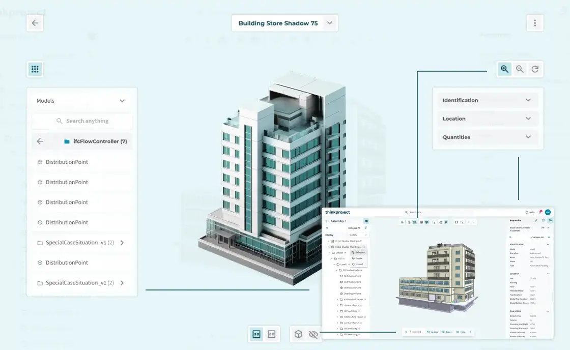
This design challenge focused on adapting two existing experiences to smaller touch devices: a document management interface for mobile and a 3D model viewer for tablet.


Rather than simply reducing the desktop interface, the goal was to reconsider how information, navigation and actions could work within the constraints of smaller screens and touch interaction.

My Role

Product Designer · UX/UI


I was responsible for analysing the provided interfaces, identifying the main usability constraints, restructuring the information hierarchy and translating the existing functionality into responsive and touch-oriented experiences.


I also created the supporting component and pattern structure in Figma to maintain consistency across the proposed solutions.

02. Context

Understand the project context, its constraints, and the goals to be achieved

Task 01 — Responsive · Desktop → Mobile


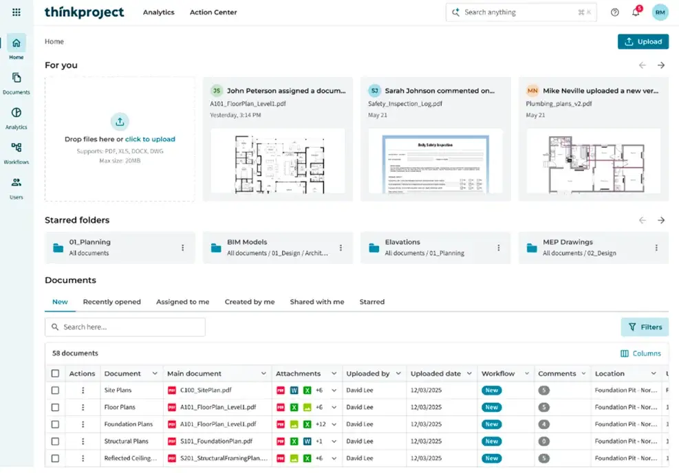
The first challenge was to adapt a dense document-management interface designed for desktop to a 375px mobile viewport.

  • Limited screen width
  • Dense document information
  • Multiple navigation levels
  • Existing desktop functionality
  • Touch interaction

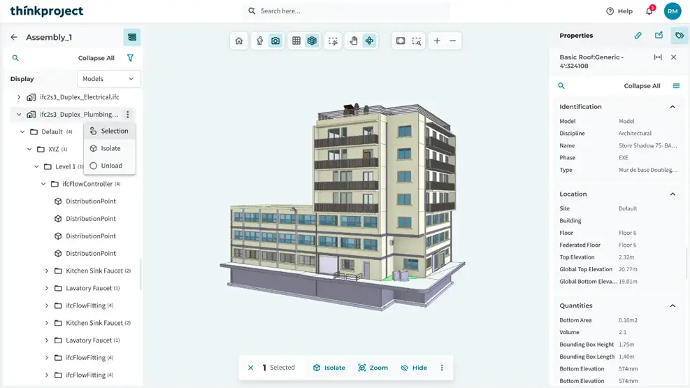
Task 02 — Tablet · Desktop BIM Viewer → Tablet


The second challenge focused on a 3D model viewer intended for use on a tablet in construction environments, including offline scenarios.

  • Touch-first interaction
  • 3D model as the primary focus
  • Complex model hierarchy
  • Element information
  • Limited screen space
  • Offline field usage


ampliar

03. Thinking & Approach

Understanding the problem through research, insights, and validation

Task 1 — Responsive Web Application


The existing product is a web application designed primarily for desktop use. The challenge was to adapt the document management experience for mobile browsers while maintaining access to its core functionality.

Requirements

  • Design a clear and usable mobile experience
  • Preserve the essential functionality of the desktop experience
  • Remove or adapt elements where necessary, explaining the rationale
Task 2 — Native Tablet App


The existing 3D viewer is accessible on the web, but the experience needed to be reconsidered for a native tablet application used by construction managers on site.

Requirements

  • Define a touch-first approach for tablet devices
  • Prioritise the 3D model as the main workspace
  • Support use in construction environments, including offline scenarios
  • Design a focused tablet experience rather than reproducing every desktop functionality

04. Challenge / Solutions

Key issues identified and the design decisions made to address them
Challenge

Part 1 — Mobile document management

  • Adapt a desktop-first document management experience to mobile, reducing information density while keeping key content, navigation and actions accessible.

Part 2 — Tablet BIM viewer

  • Adapt a complex 3D BIM experience to a touch-based tablet, keeping the model as the main focus while simplifying navigation and information access.

Solution

Part 1 — Mobile document management

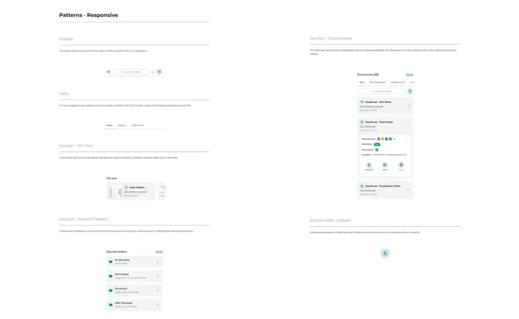
  • Tables → expandable cards to simplify document browsing

  • Desktop navigation → horizontal tabs for smaller screens

  • Progressive disclosure for secondary information and actions

  • Touch-friendly controls for key actions

Part 2 — Tablet BIM viewer

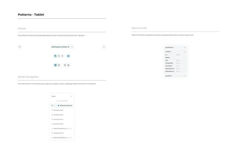
  • Touch-first controls positioned around the model

  • Drill-down navigation for complex model structures

  • Contextual information panels for element data

  • Floating controls to preserve the model as the main focus

05. Core Experience Design

How the product is structured, navigated, and experienced from the user’s perspective

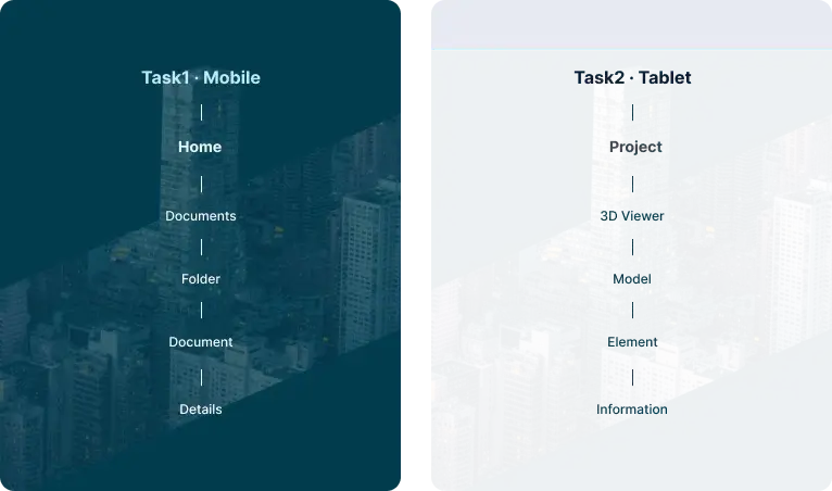
Structuring complex project information

Show how you organised the information for both experiences:

Mobile
Home → Documents → Folder → Document → Details

Tablet
Project → 3D Viewer → Model → Element → Information

Adapting navigation to each context

Mobile navigation was simplified into horizontal tabs and drill-down patterns, while the tablet viewer uses contextual floating navigation to preserve the model as the main focus.

Progressive disclosure for complex information

Information and actions are progressively revealed when needed, reducing cognitive load while keeping deeper functionality accessible.

Designing around context and constraints

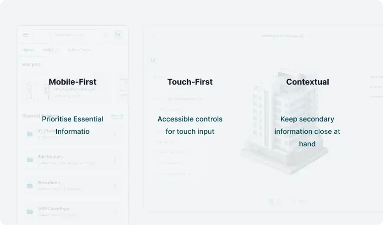
Mobile-first
Prioritising essential information and actions on smaller screens.

Touch-first
Making controls accessible and comfortable for tablet interaction.

Contextual
Keeping secondary information and controls available without competing with the main task.

06. Visual

Quick project overview, scope, role, and overall context

Visual Identity

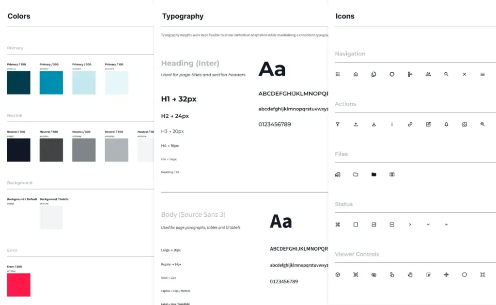
A minimal visual system focused on clarity and contrast, allowing content and structure to drive the experience.
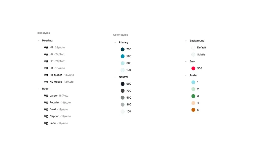
A functional colour palette designed to support hierarchy, readability and interaction. Primary tones highlight actions and active states, while neutral tones structure content and backgrounds. Supporting colours provide clear feedback and status.
Primary / 700 #023C4E
Primary / 500 #008FB1
Primary / 300 #C5E8EF
Neutral / 900 #111827
Neutral / 700 #424345
Neutral / 500 #7E8588
Background / Default #FFFFFF
Error / 500 #FF1946

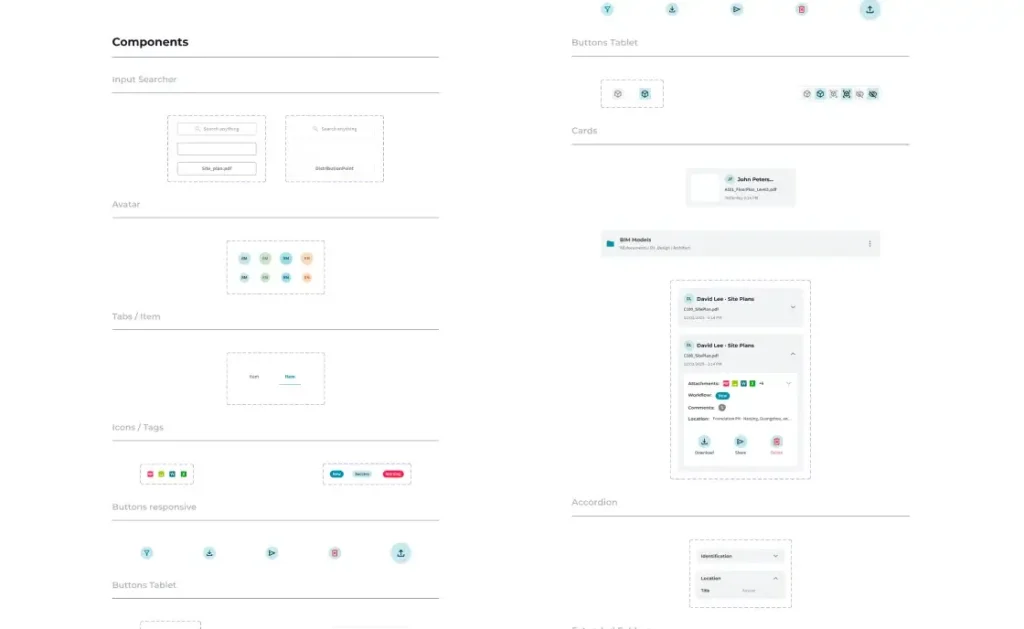
Components

Core product components designed to support navigation, readability, and interaction across long-form case studies

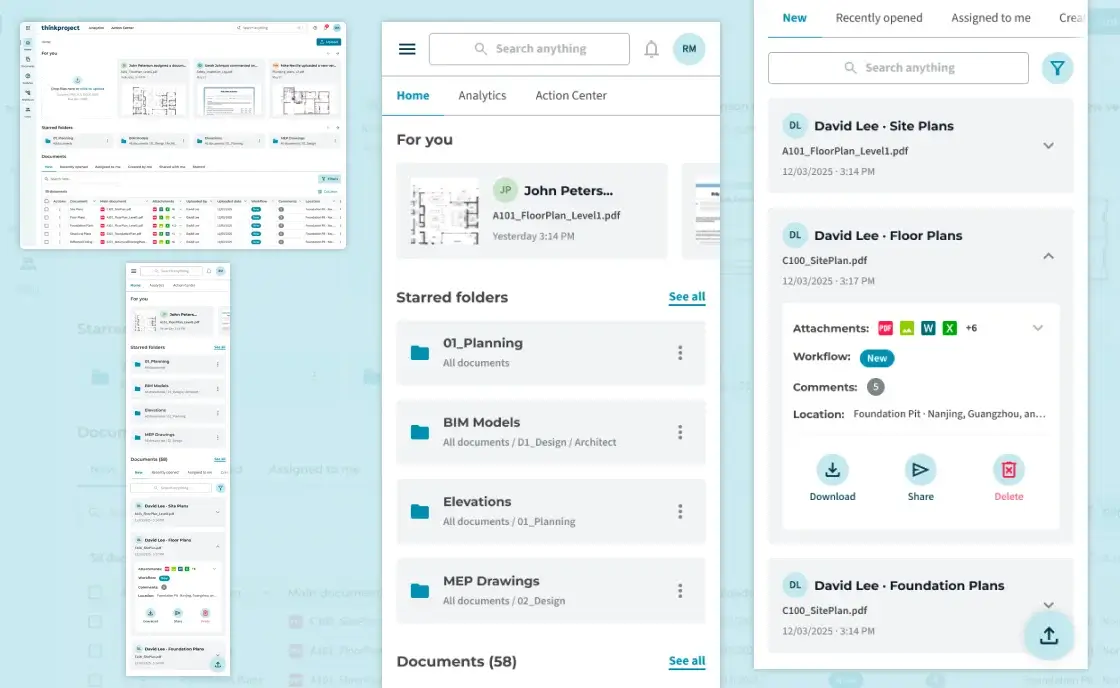
Interface Screens

How the platform is navigated and experienced in real use

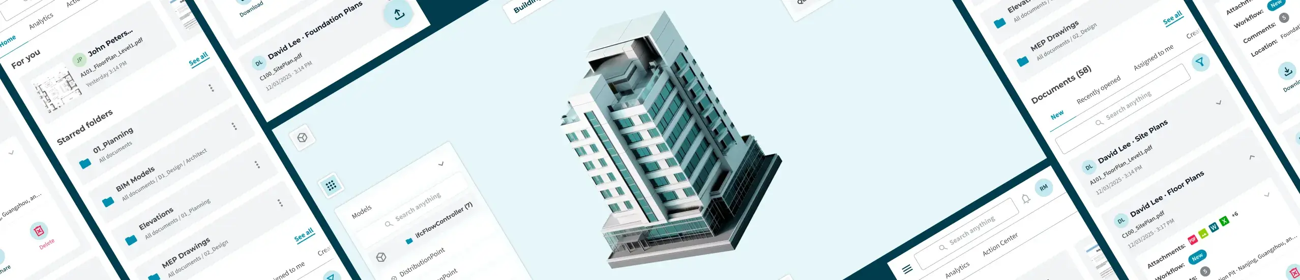
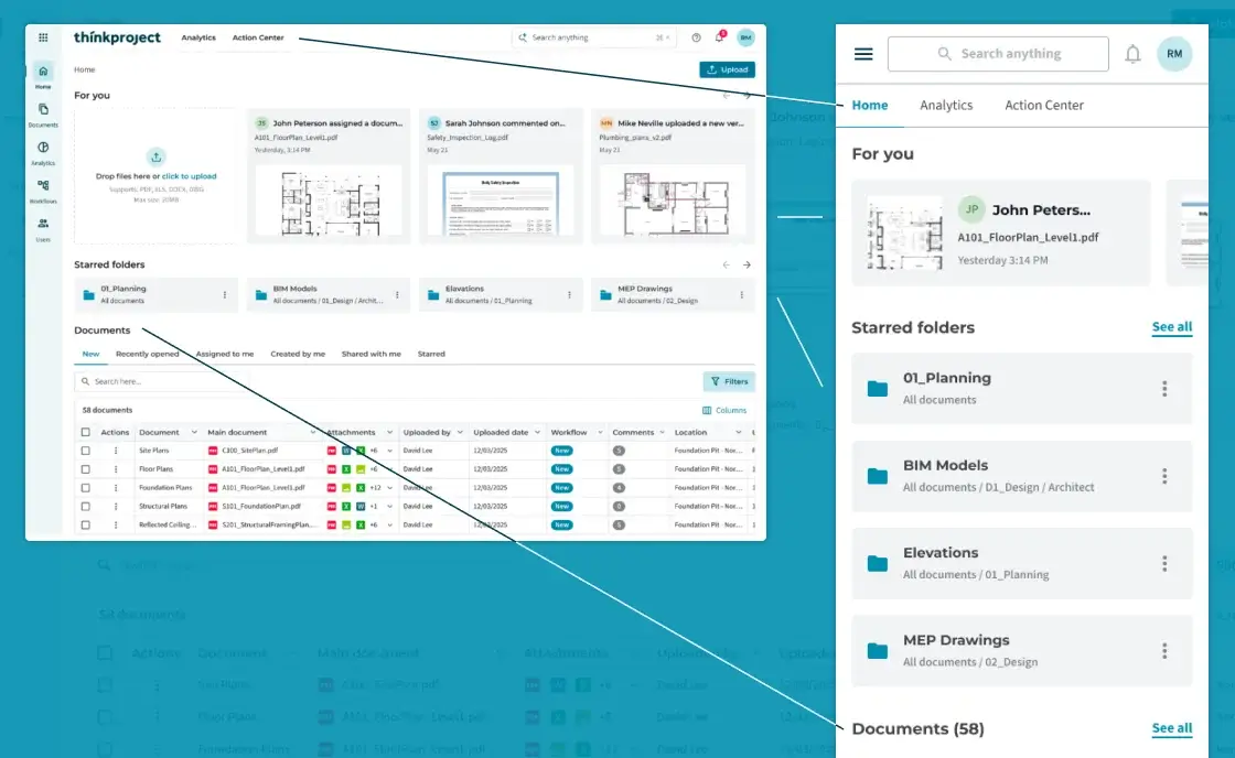
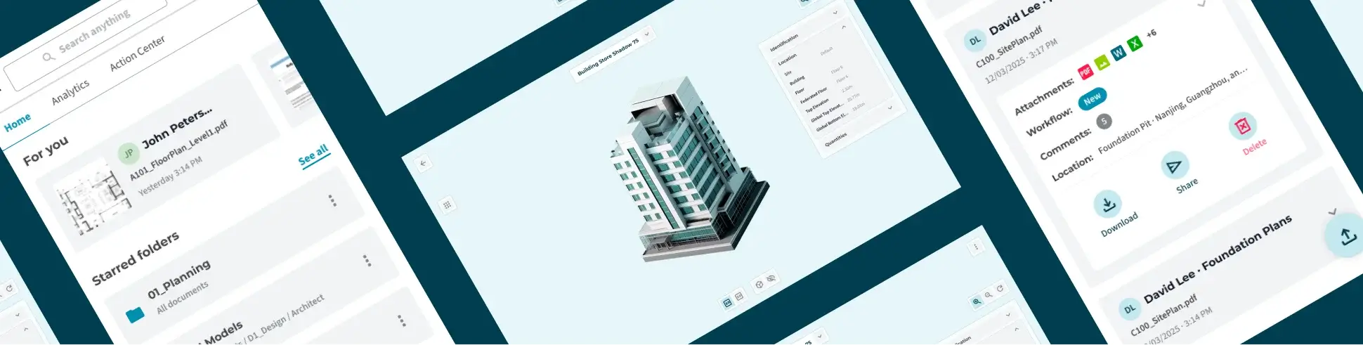
The desktop experience was restructured for mobile by prioritising the information and actions most relevant to the user’s immediate needs.

The layout was simplified to reduce visual density while maintaining access to the core document management experience.

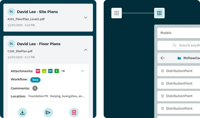
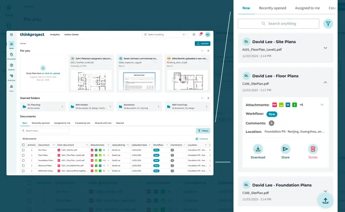
The desktop table was replaced with a card-based structure better suited to narrow screens and touch interaction.

Key document information remains visible at a glance, while secondary details are kept available without requiring users to leave the document context.

Document cards use progressive disclosure to balance information density and accessibility.

Attachments, workflows, comments and location remain available within the same context, but are revealed only when required by the user.

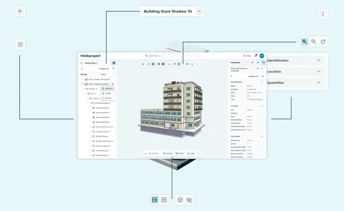
The tablet experience was structured around the 3D model as the primary workspace.

Essential viewing and navigation controls remain within reach, while secondary functionality is positioned to minimise interference with the model.

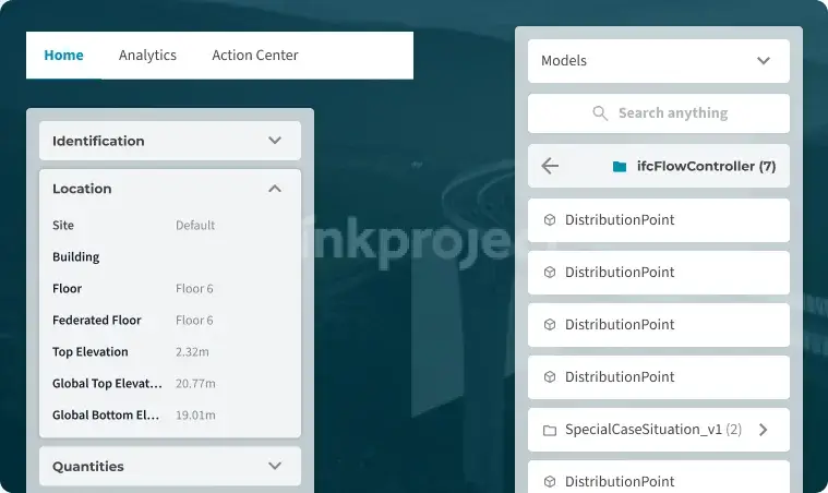
Complex model hierarchies were moved into a contextual navigation panel that can be accessed when needed.

This approach keeps the viewing area focused on the model while still providing access to deeper levels of project information.

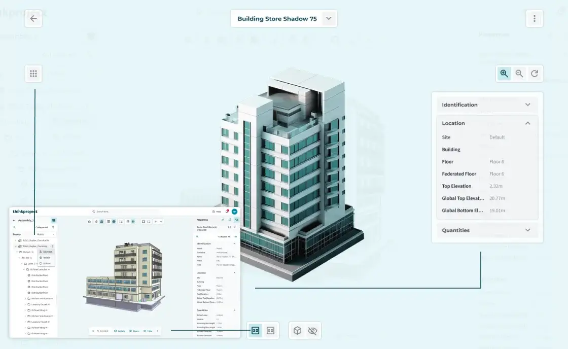
Element information was organised into expandable sections to allow users to inspect relevant properties without losing sight of the model.

This creates a more focused inspection experience while keeping detailed information accessible when required.

07. Outcome / Learnings

Key issues identified and the design decisions implemented to resolve them
Outcome
  • Simplified complex information for smaller screens
  • Adapted desktop workflows to mobile and touch interactions
  • Preserved access to critical information and actions
  • Established a consistent component and interaction system
Learnings
  • Responsive design is about rethinking interactions, not simply reducing layouts
  • Complex products benefit from progressive disclosure
  • Real-world constraints help define what should be prioritised
  • A lightweight component system improves consistency and scalability